Hello world! This is a blog post on my baby girl’s nursery, which is mostly inspired by France, as well as some other European influences (such as Amsterdam). This was a fun and challenging project, to be honest, because I’ve never had to do a nursery or even had a baby before! Since this is my first one, planning the logistics of where everything will go was kind of difficult. For instance, I knew I wanted diapers and creams in the same area, but is it better in the drawer or out on the dresser? If I want it out on the dresser, how do I make sure it still looks nice? Lots of challenges here! (And why am I the most difficult client?!) Interior design is about beauty and function. Sure, it’s easy to make a pretty room, but how can I make sure it’s logical too?
Disclosure: Some of the links used in this blog post are affiliate links, which means I may receive a tiny bit of compensation if you purchase something. My views are entirely my own and I would not recommend something I’m not willing to purchase myself.
I knew some things were not necessary yet, such as books in the dresser. I mean, I literally put Jane Austen books when there are kid versions out there in her little kids’ bookcase! Haha. I’m not even ashamed. I love it. My major in college was English, so naturally, I nerd out a bit when it comes to literature …
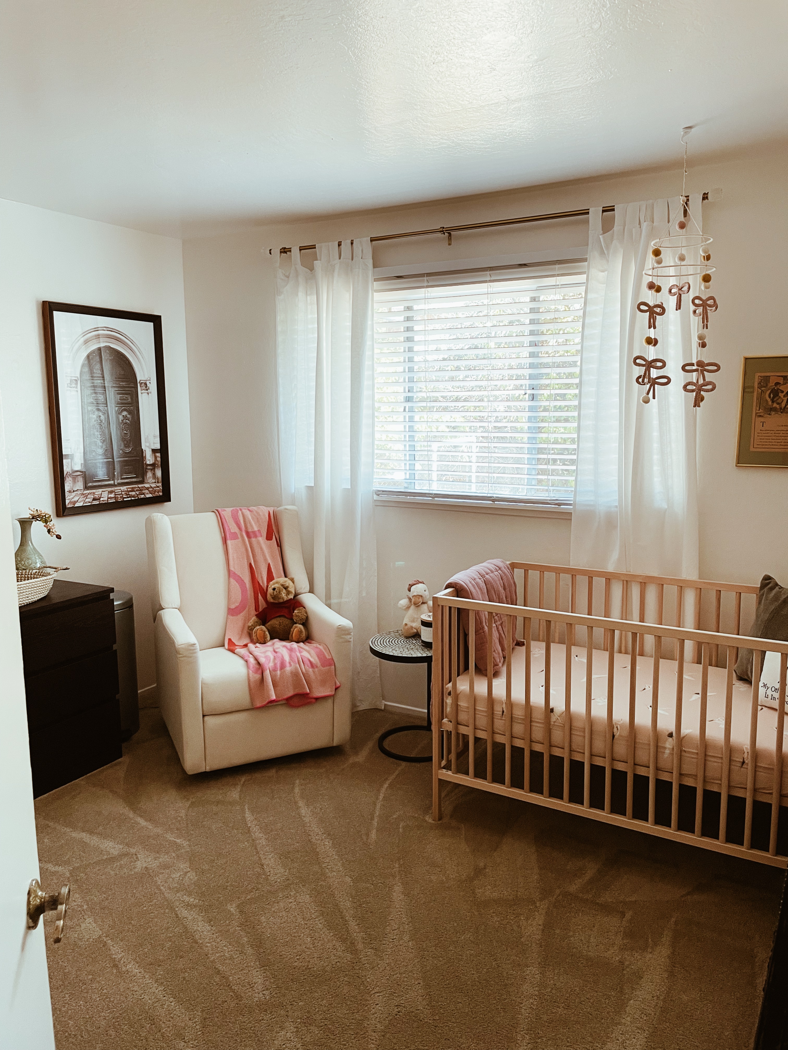
The nursery room is not large, but I really wanted it to be something that made sense for us as a family. I could have done a generic “French” theme, but I did not want it super “kid-ish” if that makes sense. I wanted it to be whimsical and fun, but easy for her to grow into.
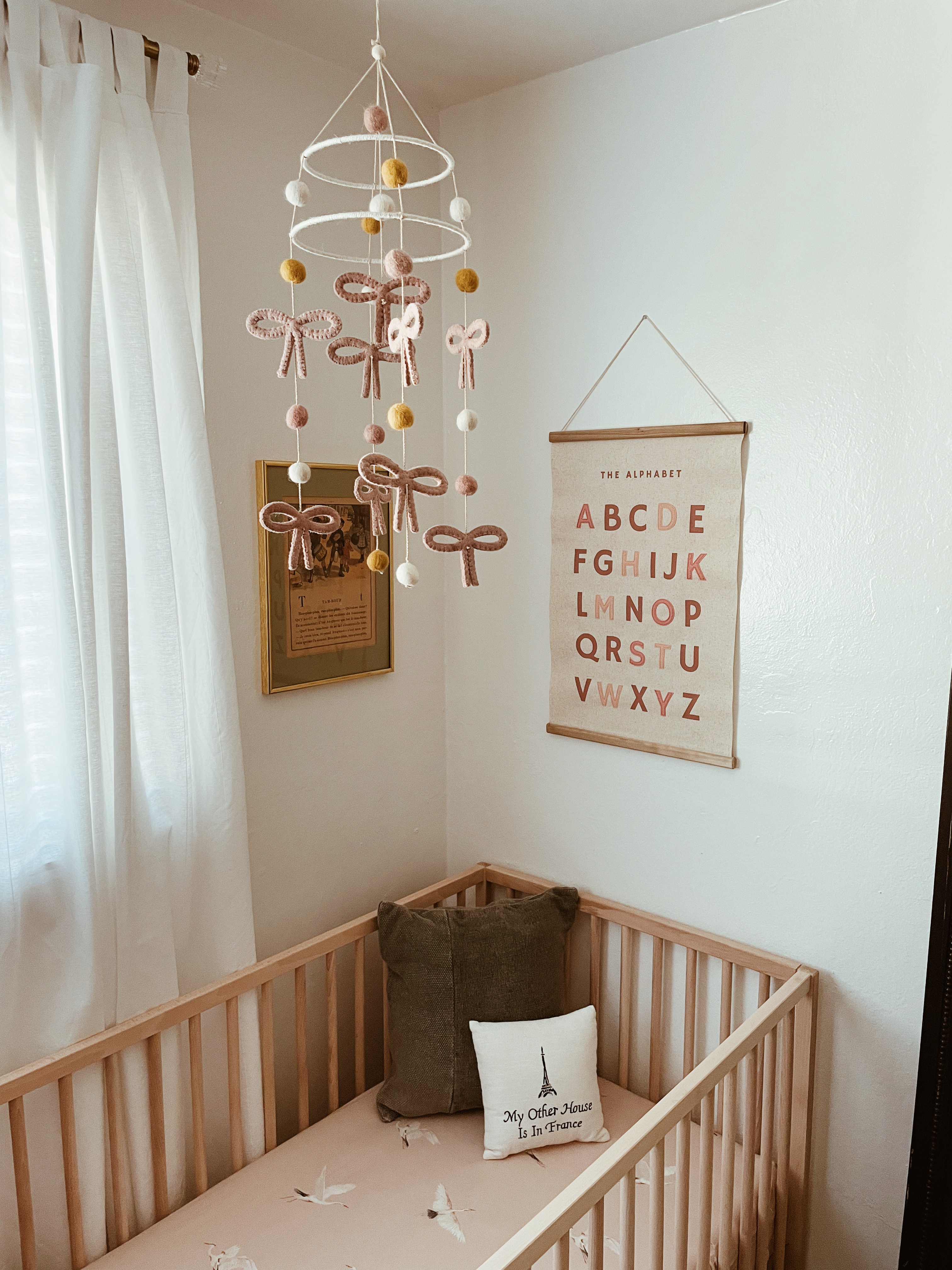
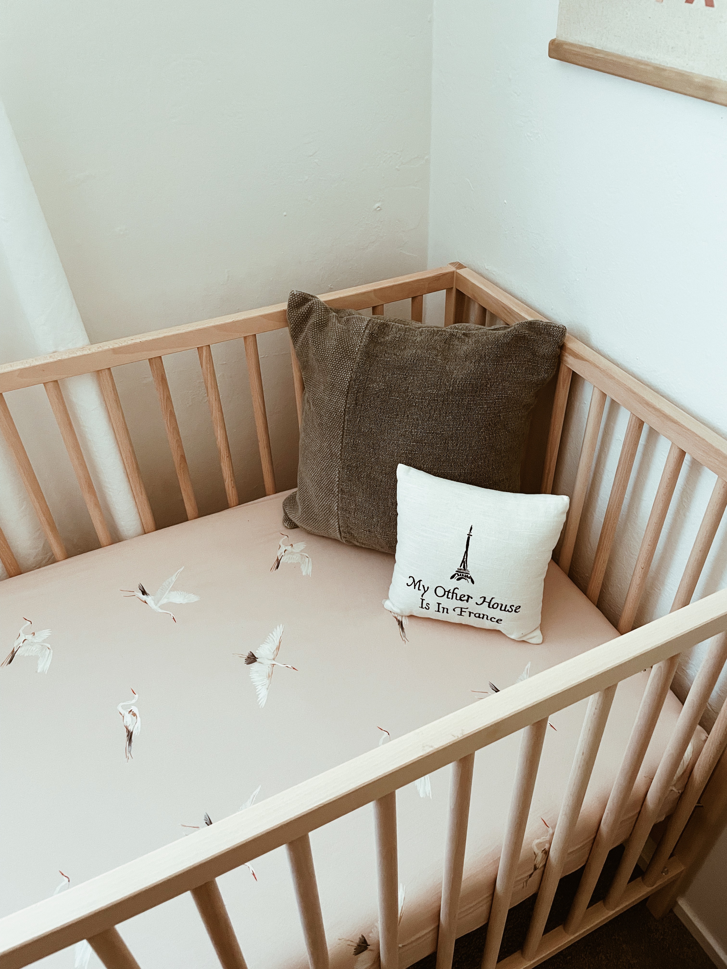
I was showing my husband the styled room and he immediately explained, “You can’t have anything in the bed!” I laughed and said, “I’m aware. This is purely for decorative use!” I proceeded to show all the Pinterest styled images of nursery cribs with styled pieces in the cribs. So before anyone starts hounding me on this atrocious behavior, just know it’s “for the ‘gram” as they say.
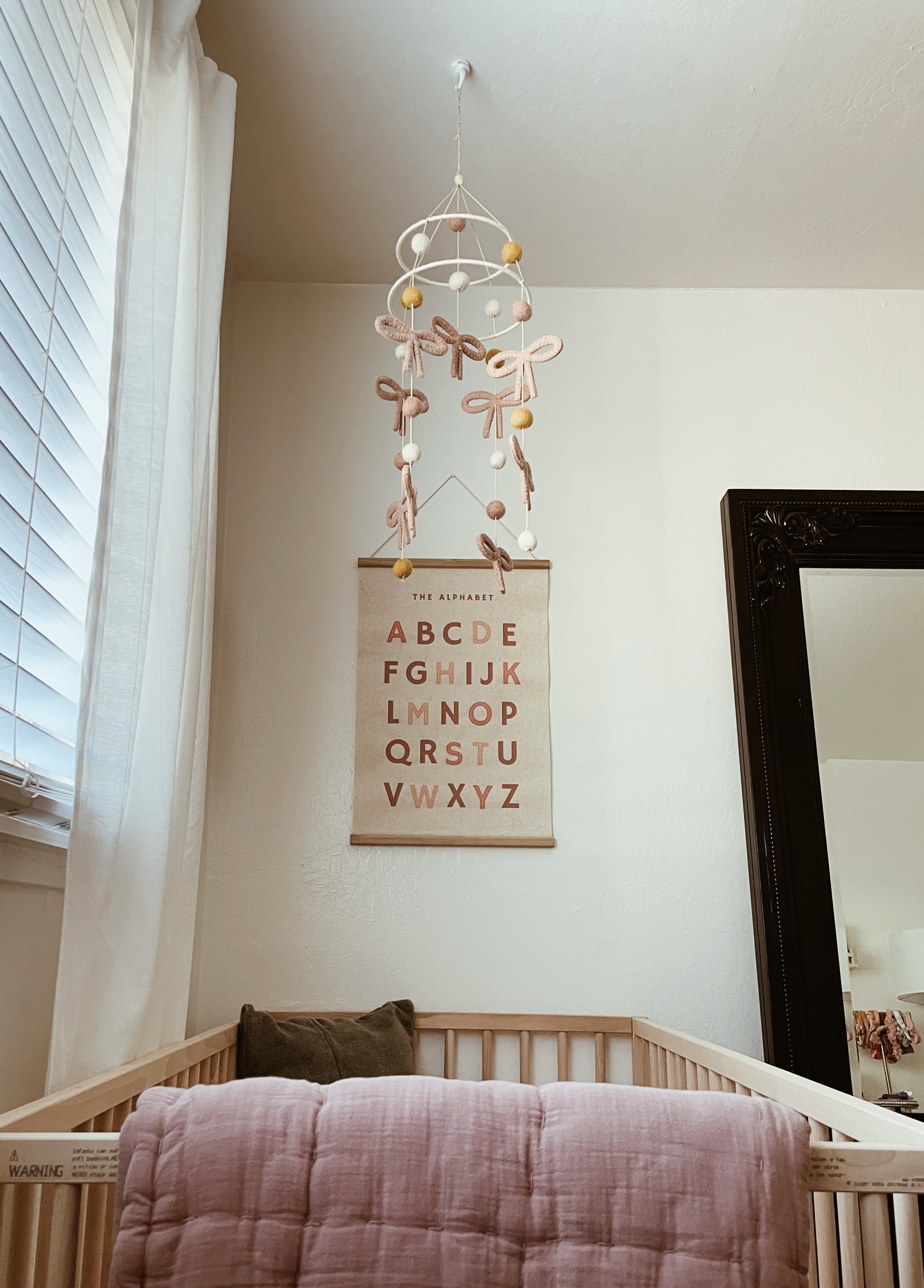
The crib area is one of my favorite areas. I love the crib sheet because of its classic style. I would have it on my own bed, for instance, not just as a kids style if I could! The mattress itself is the “The Original”Newton” which is probably a little bougie and not necessary, but it is peace of mind for a first time mom like myself. Since it’s 100% breathable, it prevents her from suffocating if she’s face down, as well as makes it easy to clean. For a clean freak like myself, I love this feature! She does not use the crib often yet, but I’m confident we’ll be happy with this baby mattress choice.
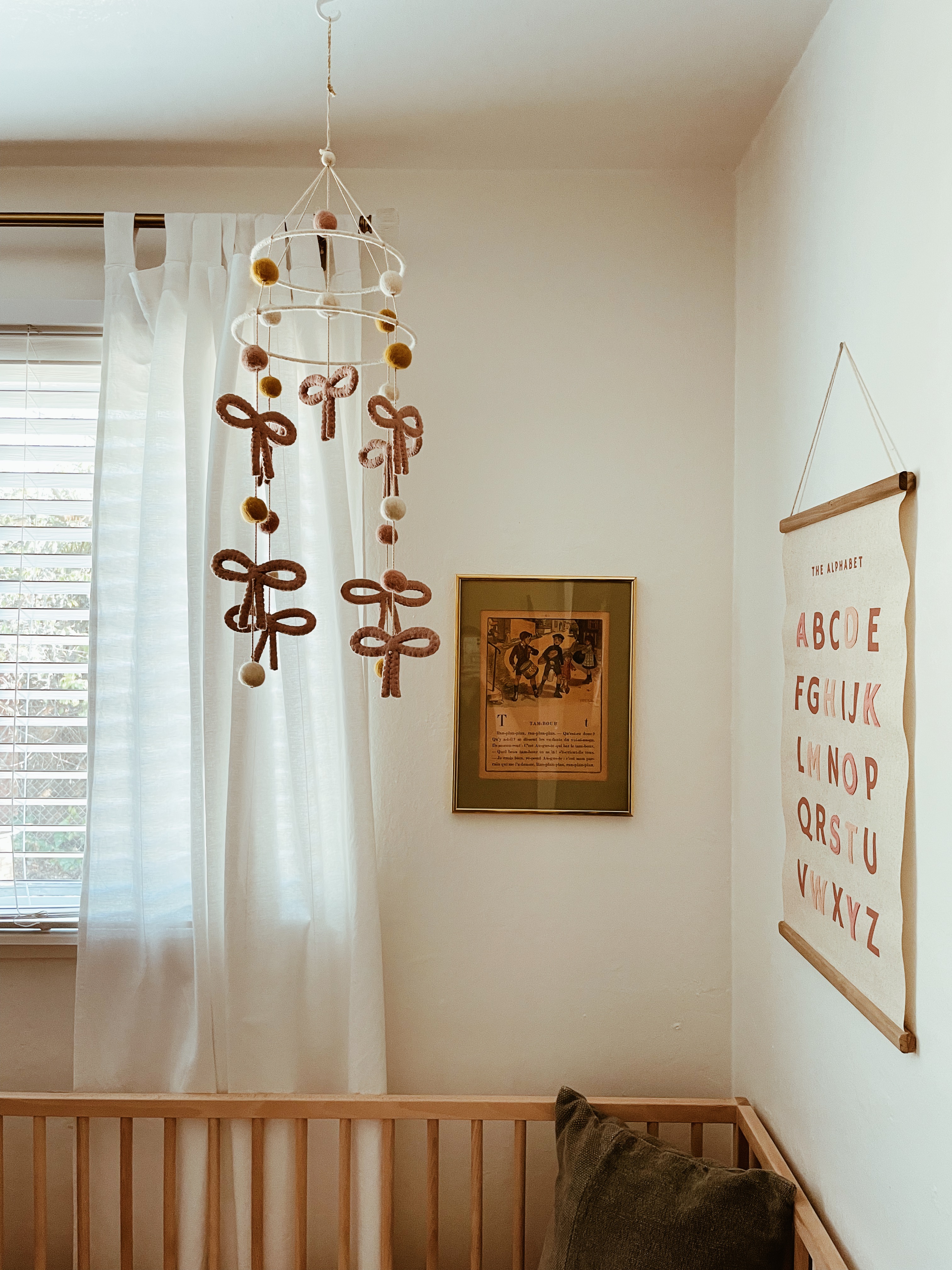
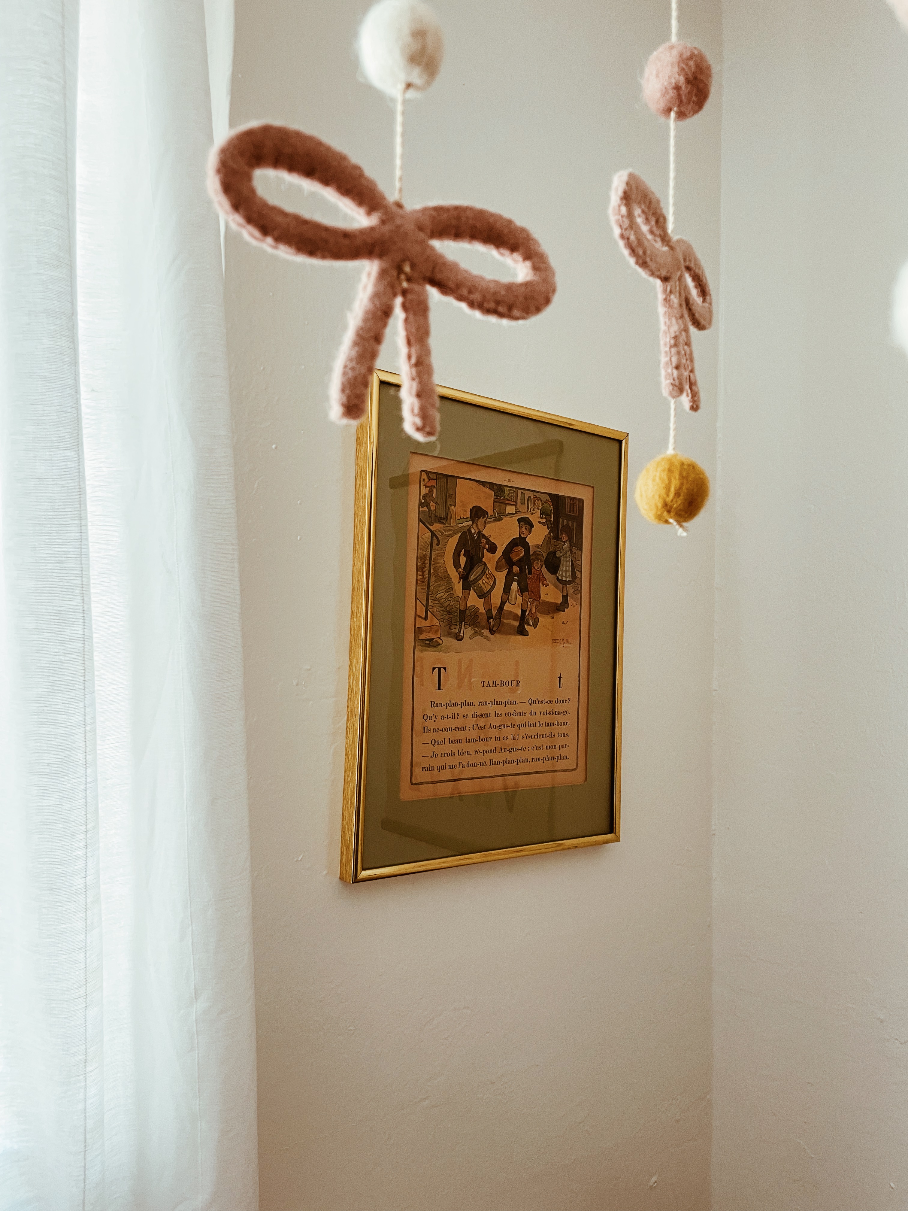
I love incorporating some vintage wherever I can. This always adds character that buying new can’t necessarily do. It’s a funny story, actually, that I saw this French vintage art print and didn’t buy it. I couldn’t stop thinking about it, but it was at a vintage shop in an area I’m rarely in. A year later, I asked if they had it on the off chance it was still there, and she pulled it from the back with shattered glass and gave it to me for a discount. Vintage always has a story! It was meant to be. 🙂
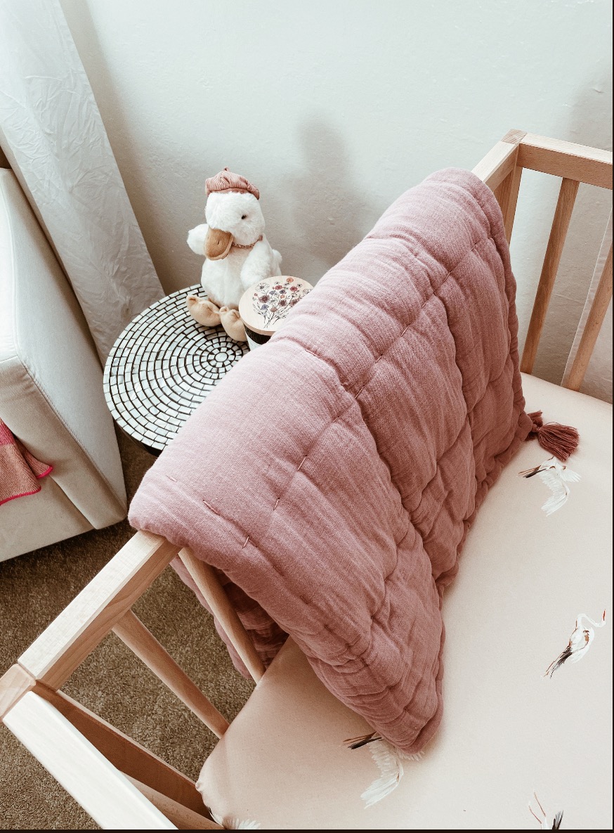
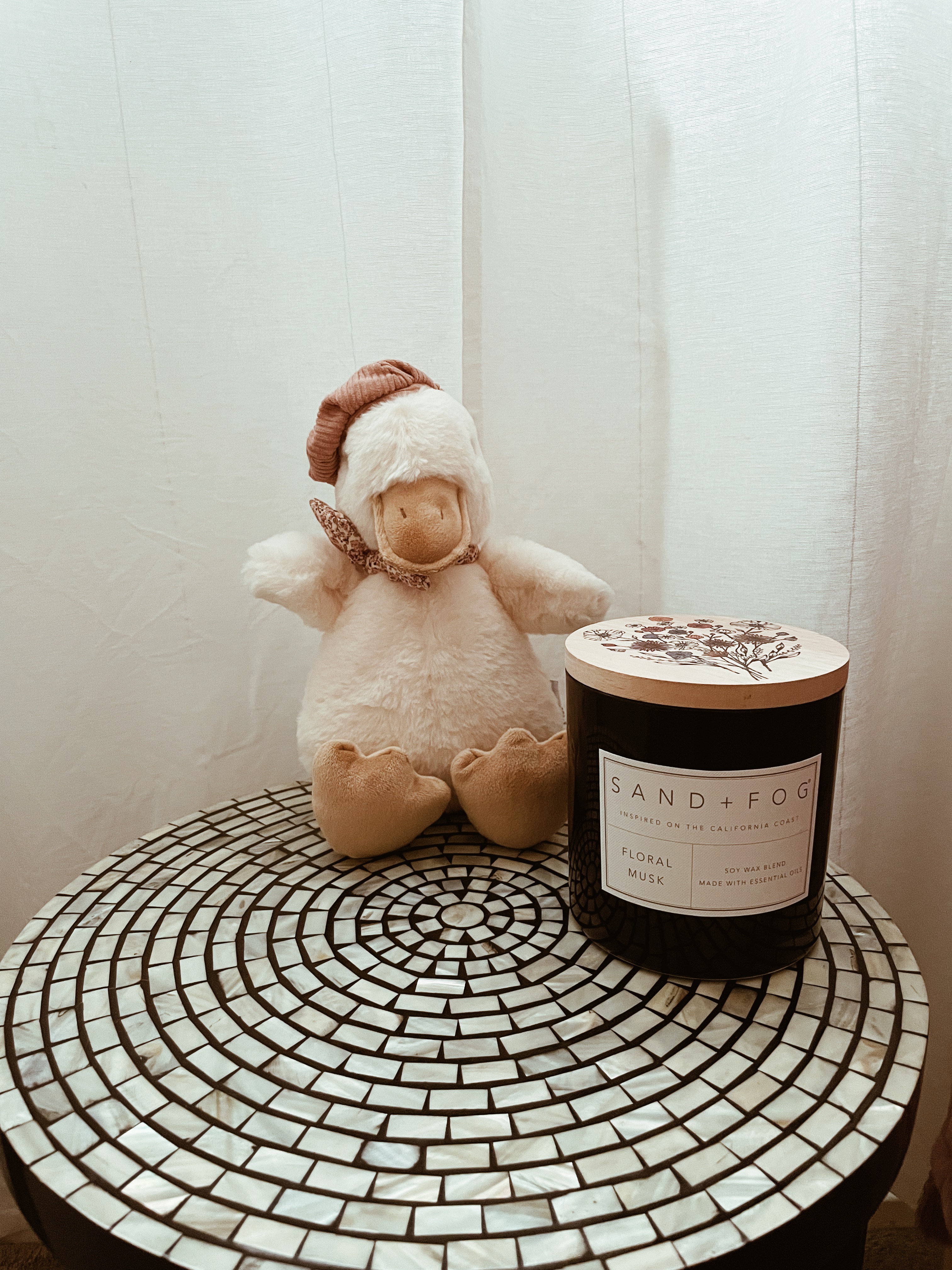
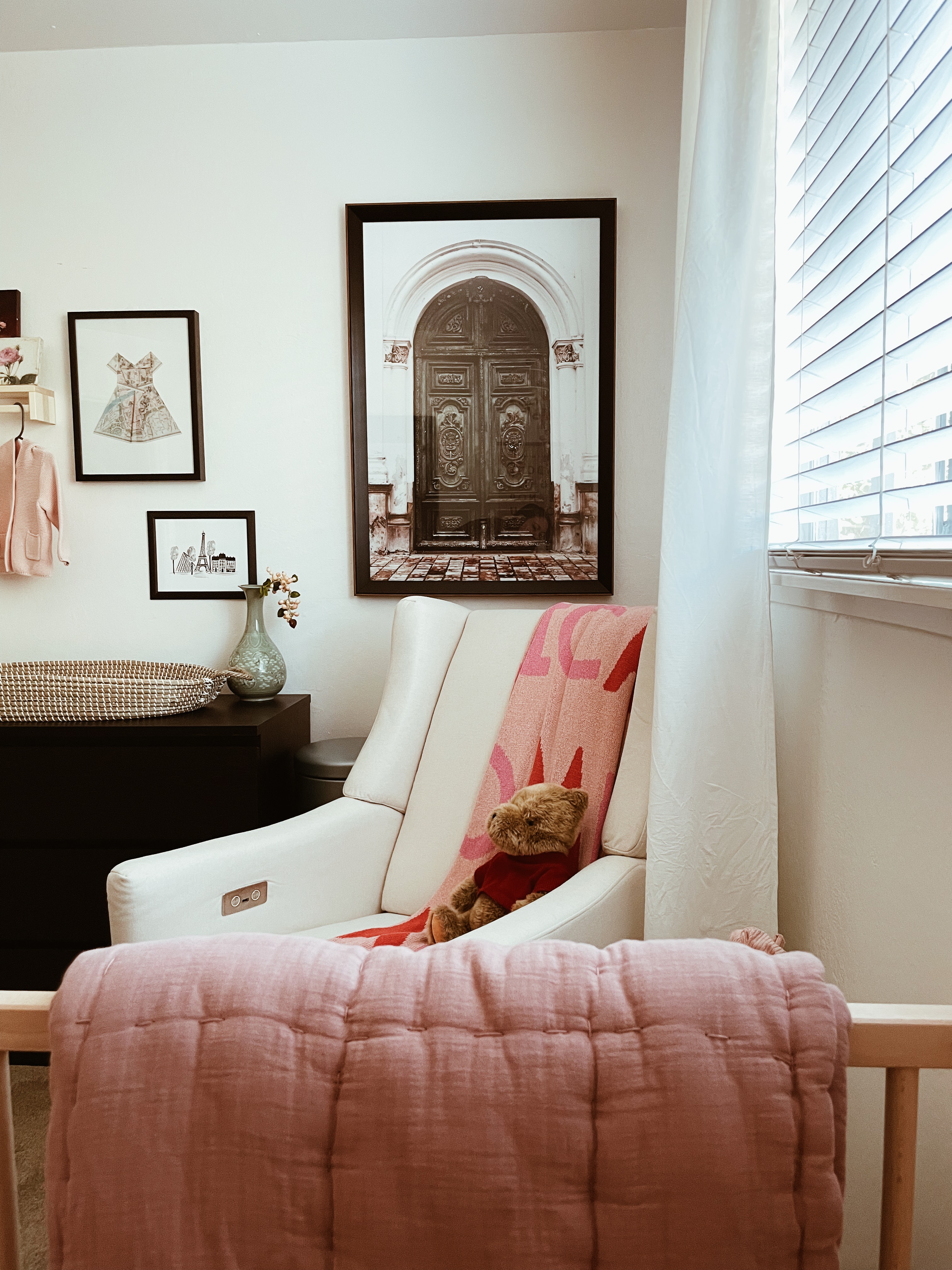
The little duck really embodies this little room in my opinion! It sounds funny, but it totally does, as well as the Calhoun & Co. blanket. The duck is called “Mon Ami Colette the Duck.” You can get yours here!
The side table is thrifted for only $15 off of FB Marketplace! I didn’t know what I wanted to do for the side table at first. Again, trying to evoke that French cafè feel, while still being playful. I toyed around with just getting a generic one and doing a cute knob and painting it (like the bookcase), but found this one and immediately snagged it! I think it’s perfect for the look I was going for. 🙂
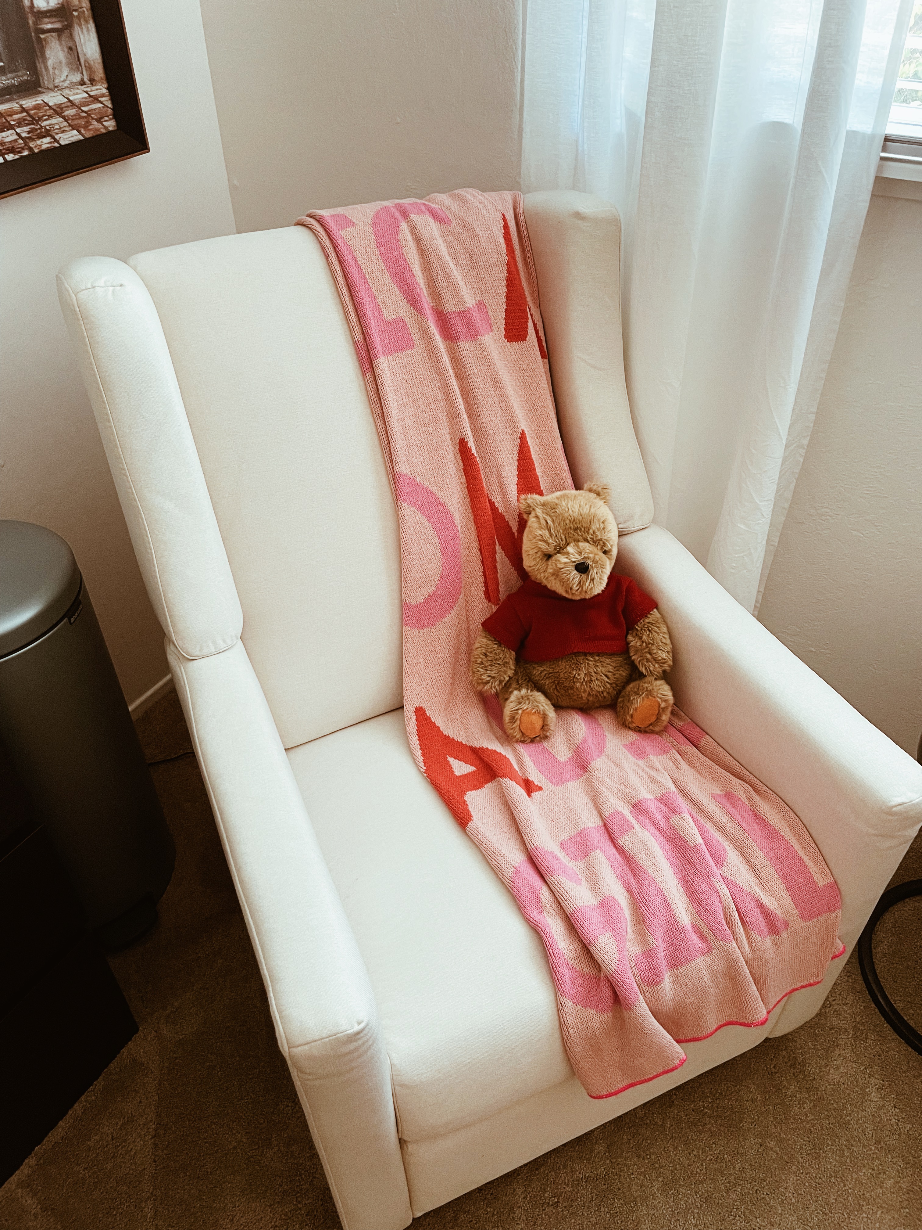
Another Facebook marketplace find: this vintage Pooh Bear!!! I love the vintage Pooh Bear. You can tell the quality difference because of the weight, details, and even the fact that the shirt is detachable. The seller was happy to give it a good home that would appreciate it, which I certainly do.
The glider from Crate & Barrel is sooo comfortable. I was using it before she arrived just to hang out! It is a glider and recliner with a USB outlet. Is it overkill? Sure, maybe, but I love it. It was the most expensive nursery item, but my generous FIL gifted it to us.
Lastly, I’ve followed Calhoun & Co. for years on Instagram, but purchased the “Mamas” blanket before I was even pregnant due to a sale haha. I knew I’d want it eventually and it was the perfect finishing touch to bring in some of the touches of red throughout the room as I mainly stuck to shades of pink.
Dresser Setup
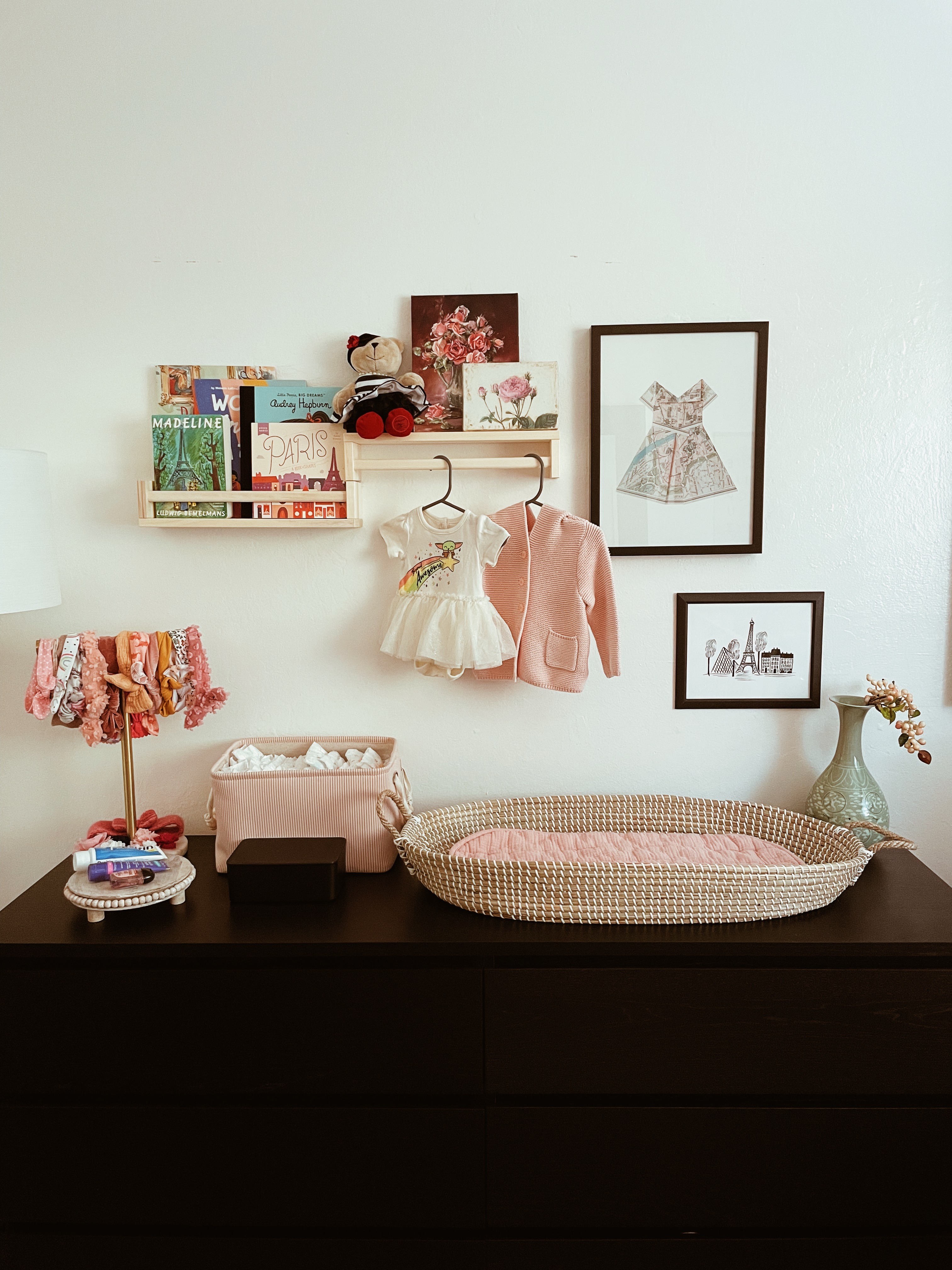
Lots of pieces here. This was my inspiration starting point: this IKEA Malm Dresser! This is in the black-brown, but I already knew I liked it because we have it in a brown color that’s discontinued. (You can see it in our Dallas apartment here.) I was hesitant to do it with such a small room, but I’m so glad I went for it. This holds all of her clothes (with the exception of a few items that hang in the closet), blankets, pacifiers, burp cloths, swaddles, etc. For a small room, it is actually perfect for storage and organization!
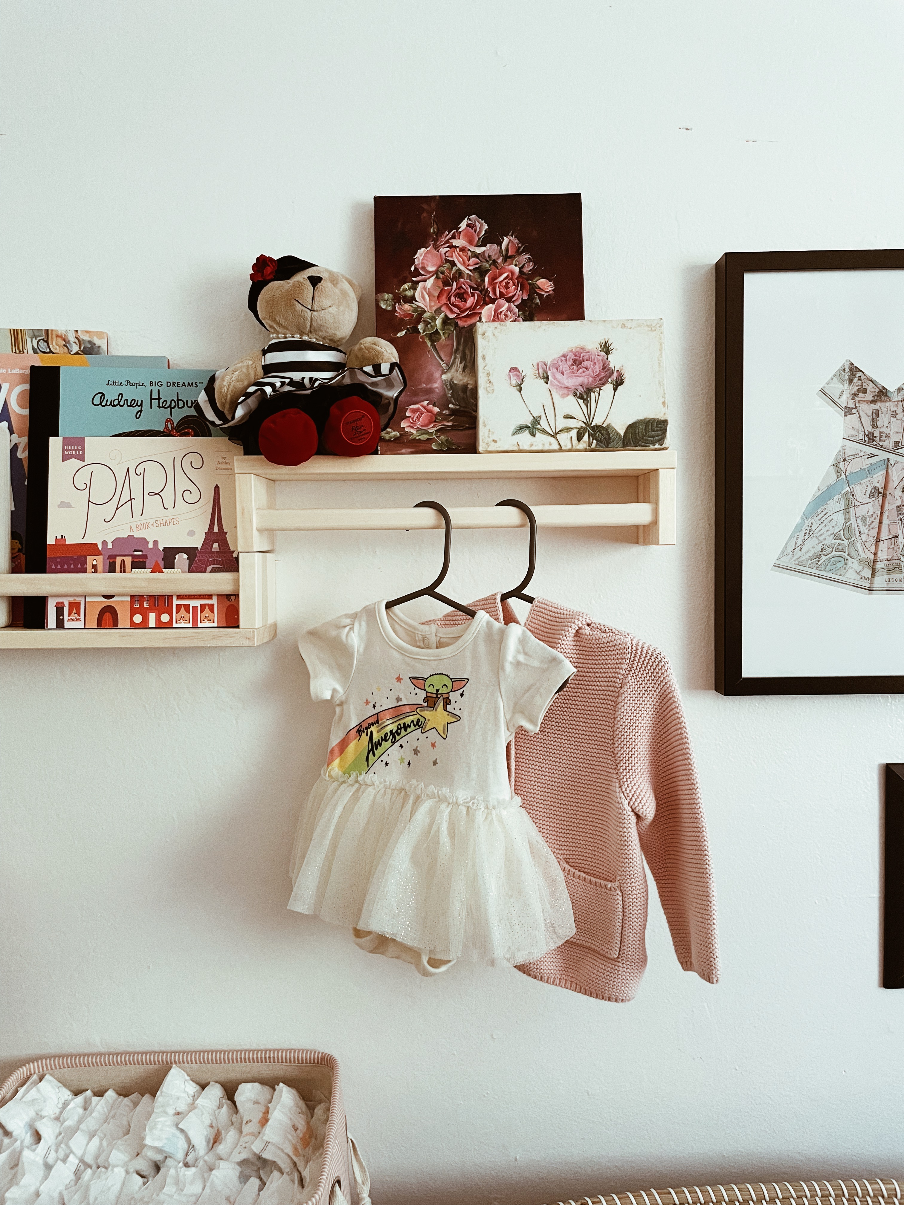
This is pretty common if you take a quick look at nurseries right now, but I used the BEKVÄM racks from IKEA as the book holders. It’s hard to beat at only $5 per shelf! To make the upper one a display style takes a bit of maneuvering as it’s not meant to be that way, but thankfully Zack figured it out so I didn’t have to hahaha.
A lot of things are items I’ve collected over the years, such as the vintage crane case, the French bear from Starbucks several years ago, the little stand for creams and diaper storage (commonly found at TJ Maxx or HomeGoods), etc. I have linked to everything else like the art, changing basket, books, and more though!
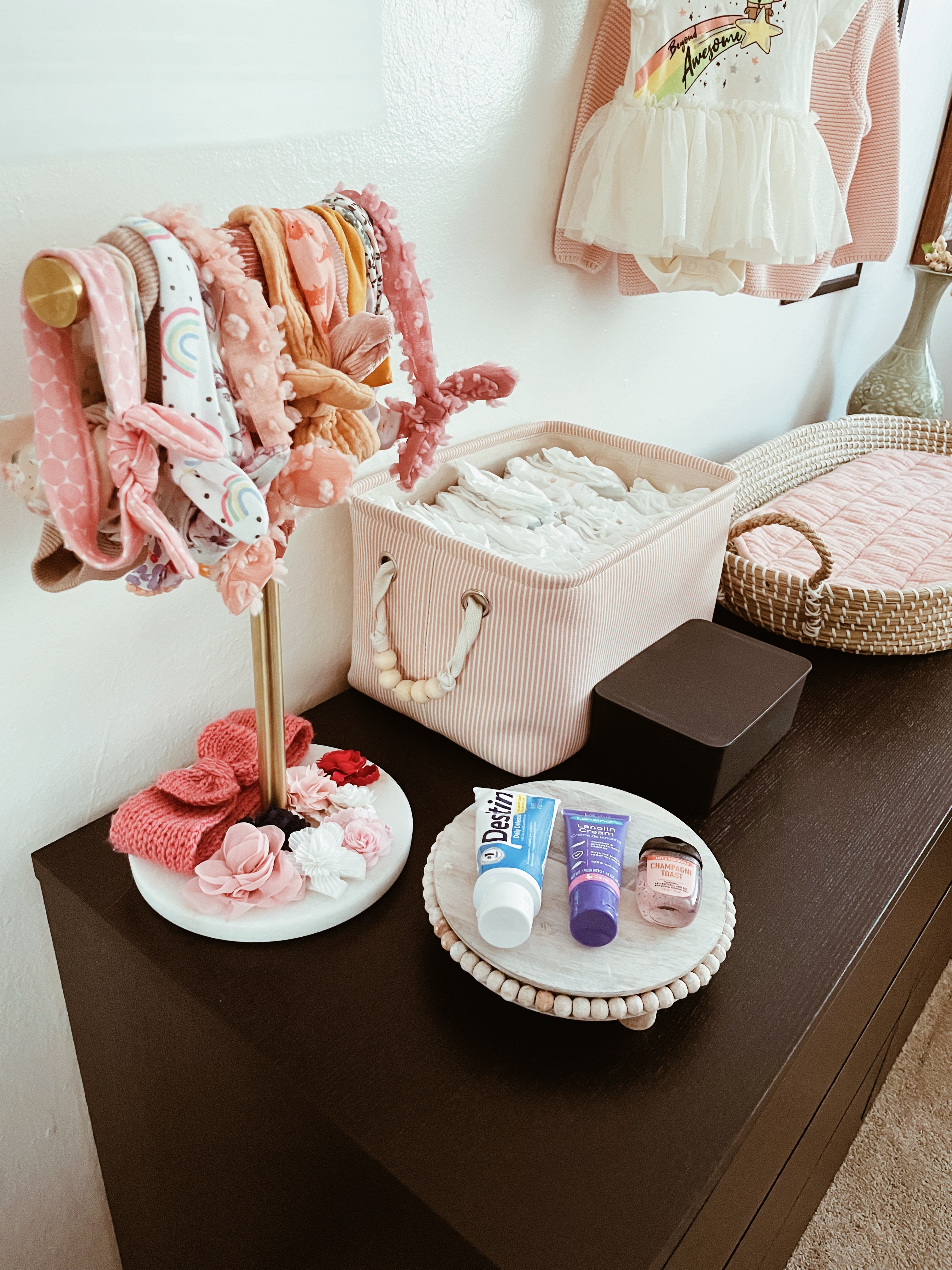
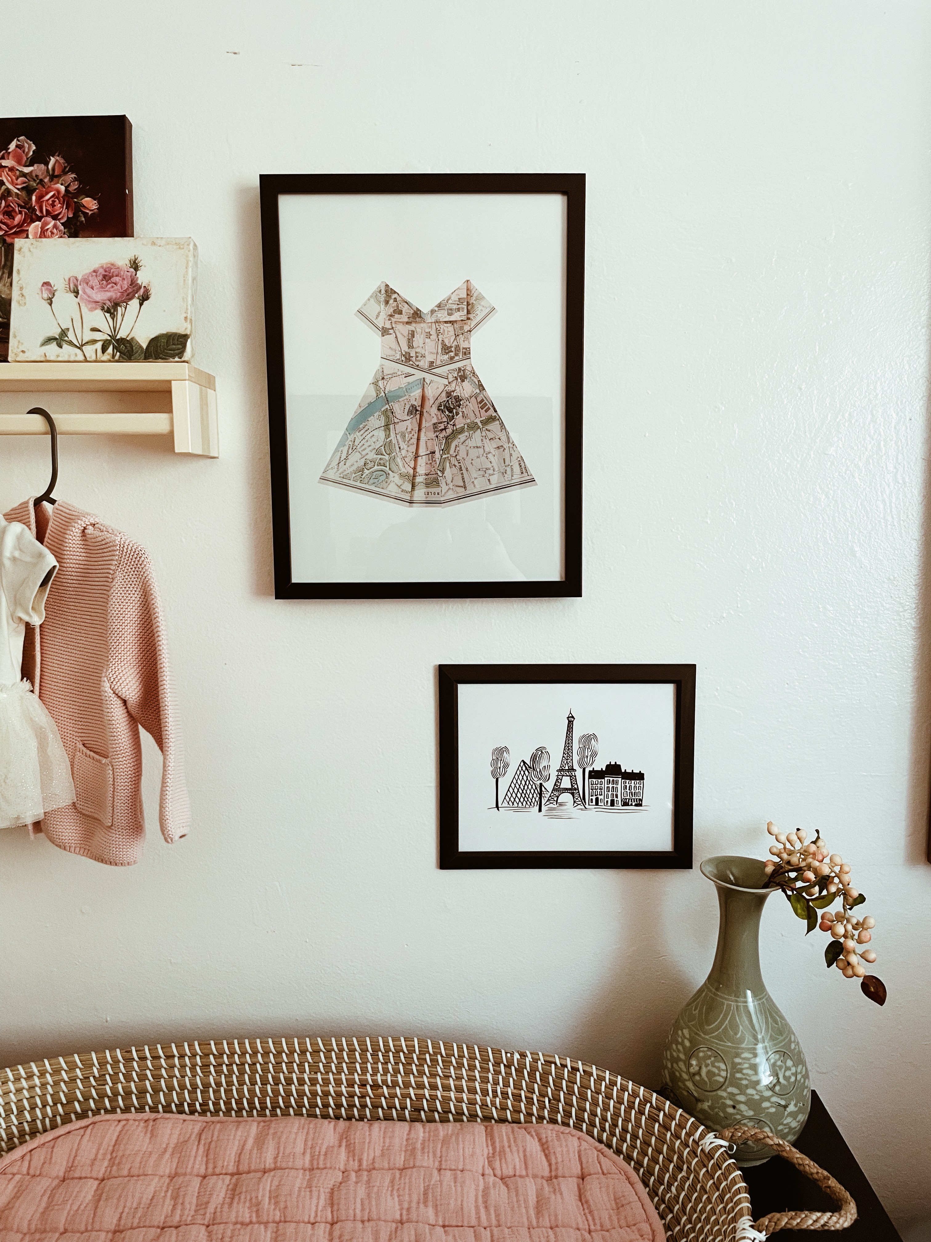
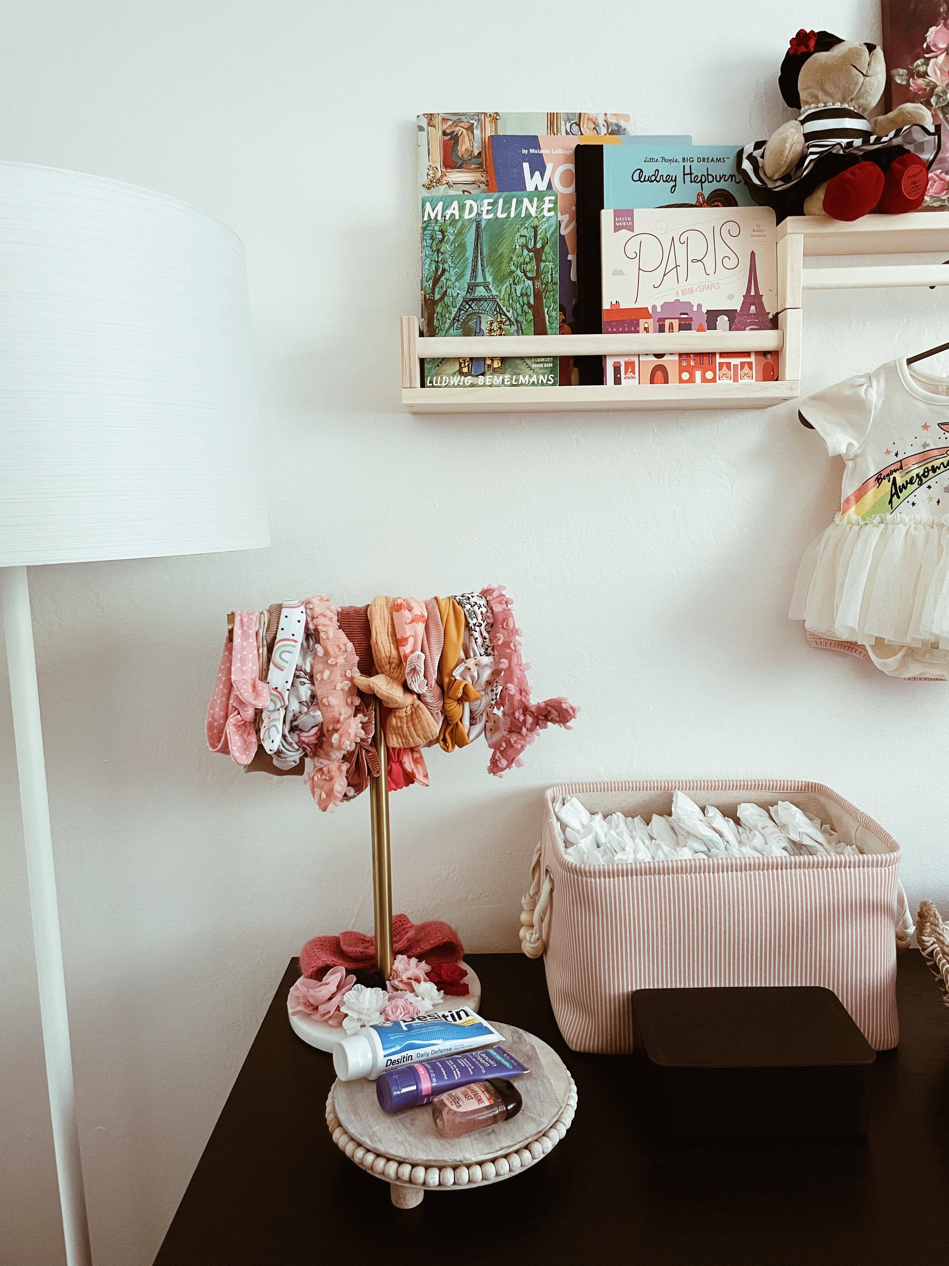
Since we have a daughter, everyone naturally wanted to buy her all the bows. At first, I was going to organize it in a top drawer, but then I thought it would be so cute to display it! I couldn’t figure out how I wanted to do it, then remembered I had this brass and marble towel holder from our last apartment (that didn’t have any towel holders attached to the wall) sitting in the garage! I pulled it out just to see how it would look and ended up liking it. You never know what will end up being perfect in a space until you try it, even if it’s unusual! Sometimes it’s even better that way because it brings a uniqueness to an otherwise “standard” style or room. Unexpected is good!
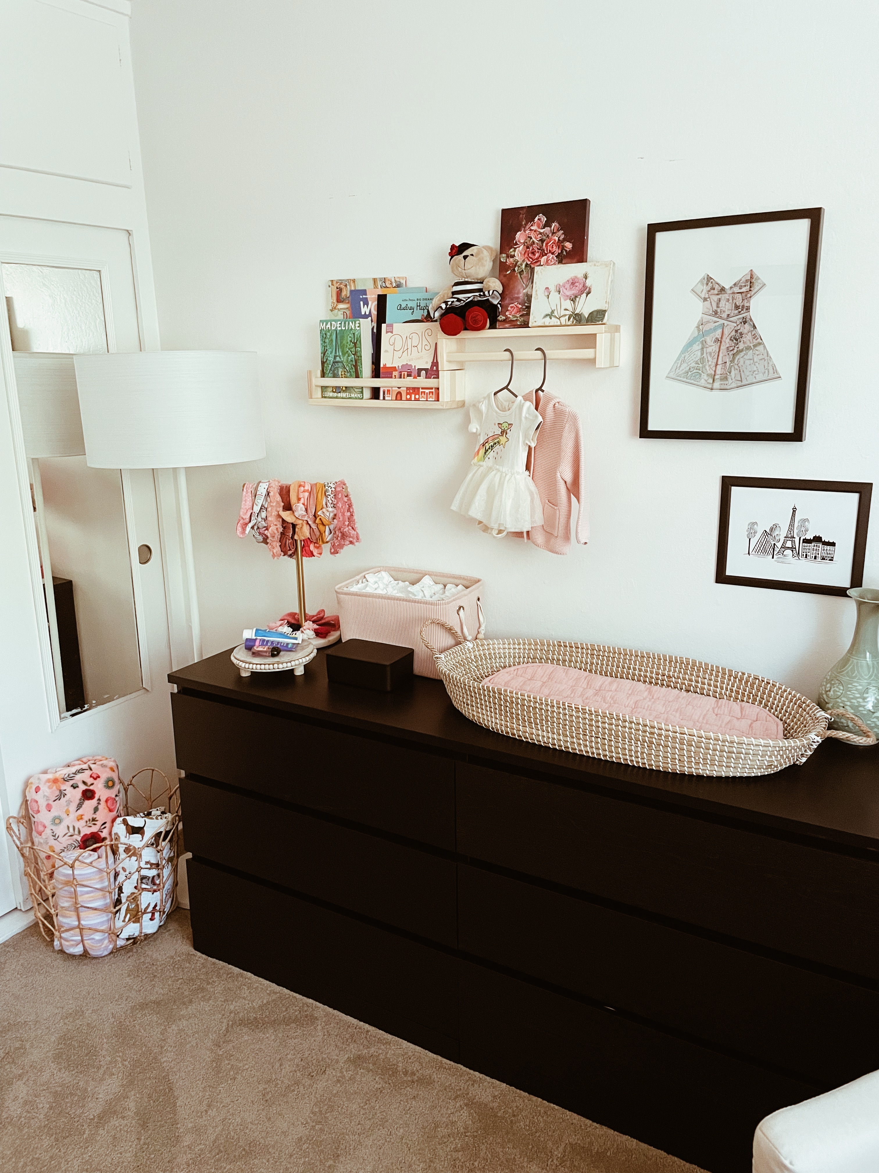
This scene just makes me so happy! It was a little tricky to work around the closet being a small space, but not impossible. Originally, I wanted this very pretty and expensive brass base with a uniquely shaped black shade, but I ended up doing this super affordable lamp instead. I think it worked out ultimately because it blends in with the rest of the space against the closet where we store random clothing and what not. In other words, sometimes when our design plan doesn’t work out, it’s for our benefit (there’s a life lesson in that somewhere, no?) …
My husband and I love to travel. Previously, he used to be a flight attendant, so we were able to fly standby to places. Super fun as a young married couple! We didn’t make much, but travel was cheap so we were rich in experiences. 😉
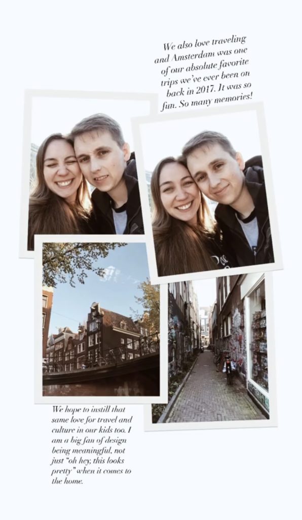
One of the places we were fortunate enough to go to was Amsterdam. We absolutely loved Amsterdam. In fact, we even considered moving there briefly because we loved it so much haha. (Although I’m sure we’d be in New Zealand before the Netherlands.) See our happy and delirious jet lagged faces above!
Long story short: I wanted to add some tulips subtly in the room. This is because Amsterdam is known for their tulips! So the tulip basket is kind of perfect, especially as I personally love florals. This also led me to my DIY project of the Amsterdam dollhouse/bookcase I painted over …
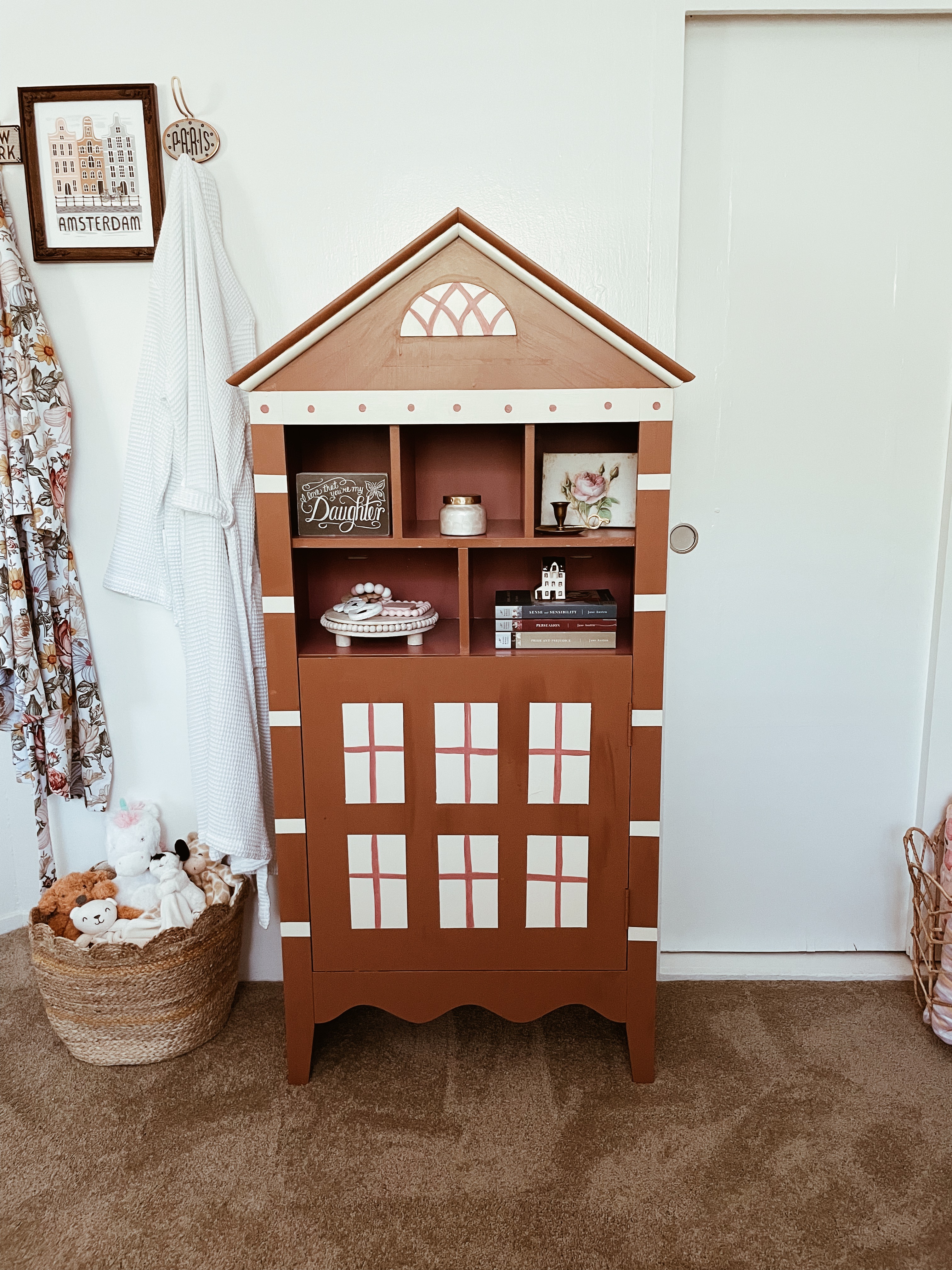
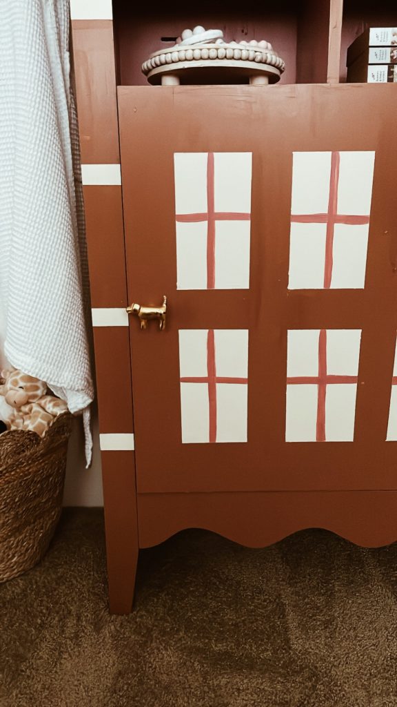
I found this bookcase online, but painted it to look like an Amsterdam home. I wanted this room to be cute, but also reflect our family and love of travel. We love to travel any chance we get and we really, truly, absolutely LOVED Amsterdam. I’m not a DIYer by any means and my attempts usually turn out terribly, but I actually don’t hate how this turned out! There were a few moments I thought “what am I doing” and “why did I do this” though, not gonna lie. In the end, I am happy with how it turned out!
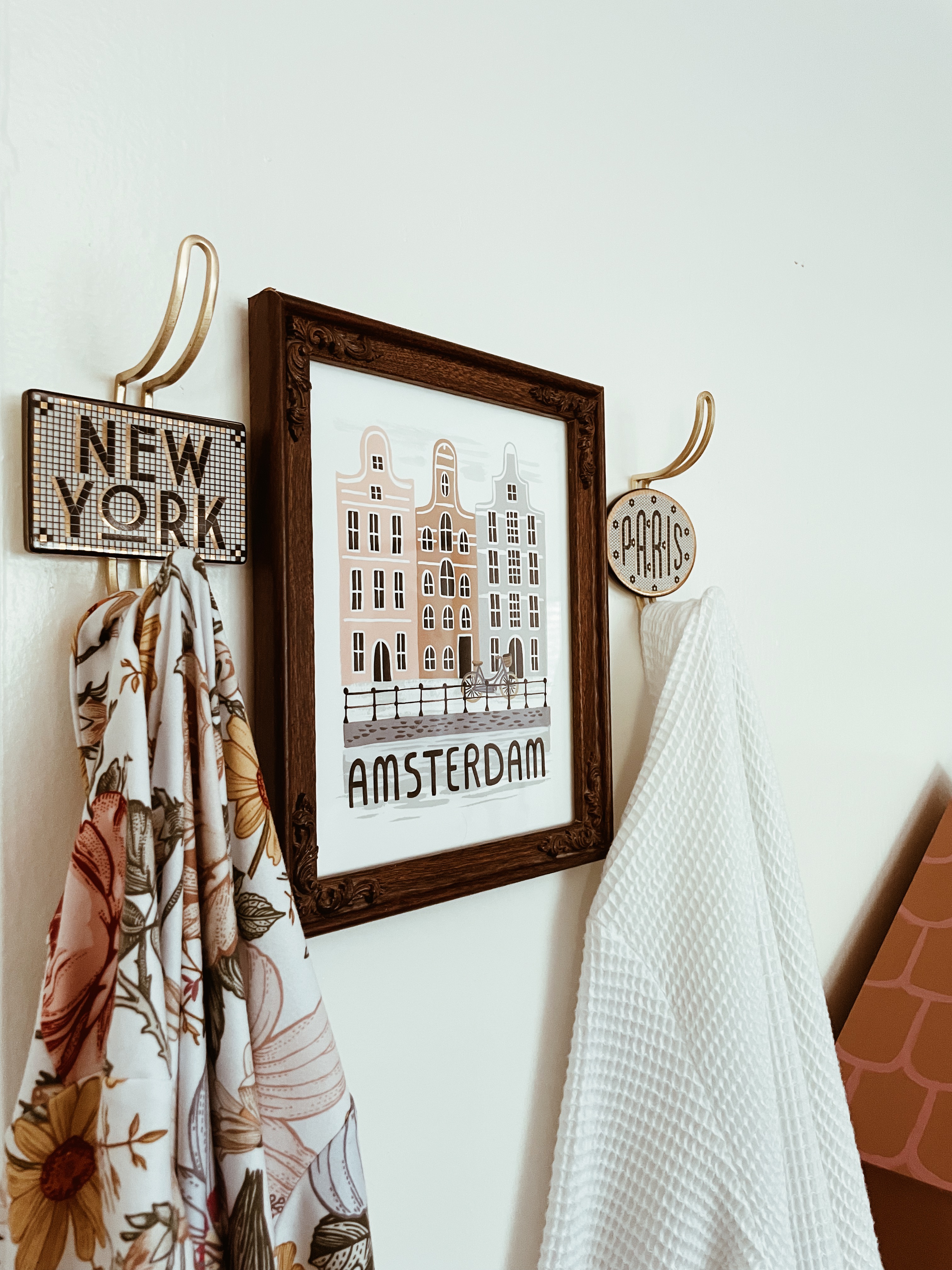
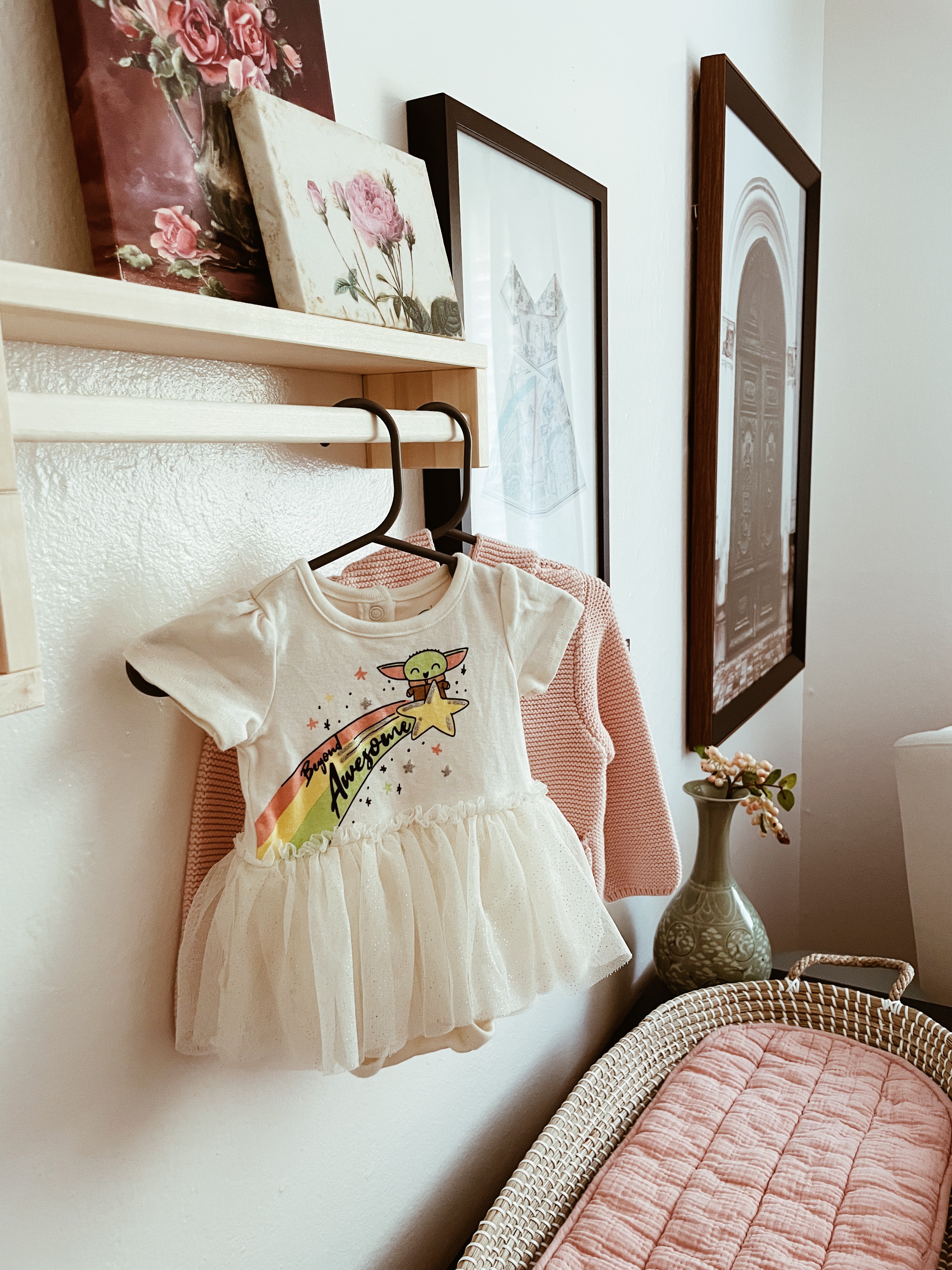
This Amsterdam art print from Rifle Paper Co. has lived in several places of ours, including when we lived in Dallas, TX for a year. I love the blend of whimsical, yet refined. The frame was a thrift find from Dallas, but I think it’s perfect because it reminds me of the intricate details of those Holland homes. Unfortunately, the cute New York and Paris hangers from Anthropologie look like they’re discontinued, but maybe they’ll bring it back. I have linked the remaining one that was the same style (but not a city). Also, newborn life = robe life.
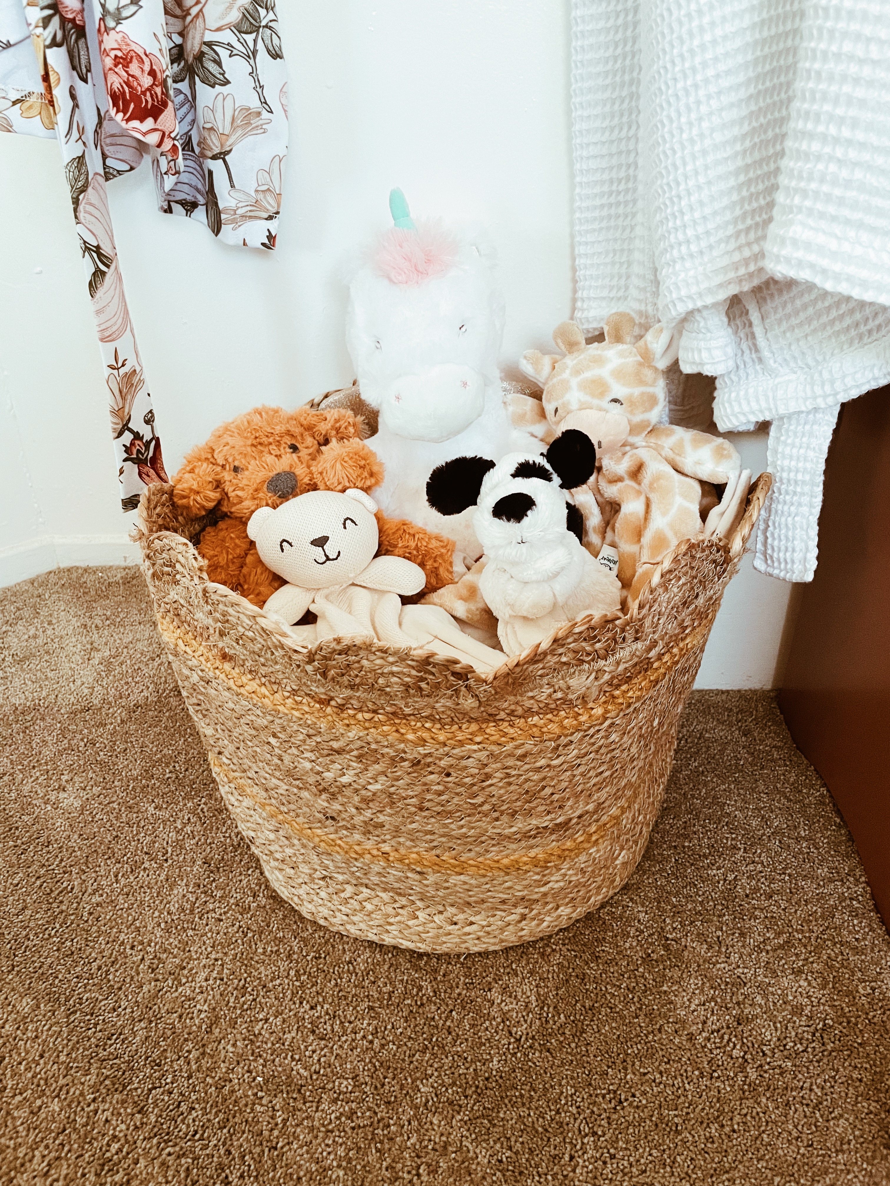
This basket was one of my earliest selections. I knew I wanted a European theme because of my big, black floor mirror that only fits in this room anyways, but this particular basket reminded me of a tulip due to the scallop shape. I also loved the color scheme of pink and yellow, so I could bring in gold/brass to contrast with the black. Between the black floor mirror/IKEA dresser, this was probably my other starting point. Sadly, this basket is no longer being made to my knowledge! All the security blankets/animal loveys are here. They look so happy! 🙂 The unicorn was a gift and it’s a stuffed animal, although I am not sure where it’s from, it’s adorable and I had to showcase it somewhere …
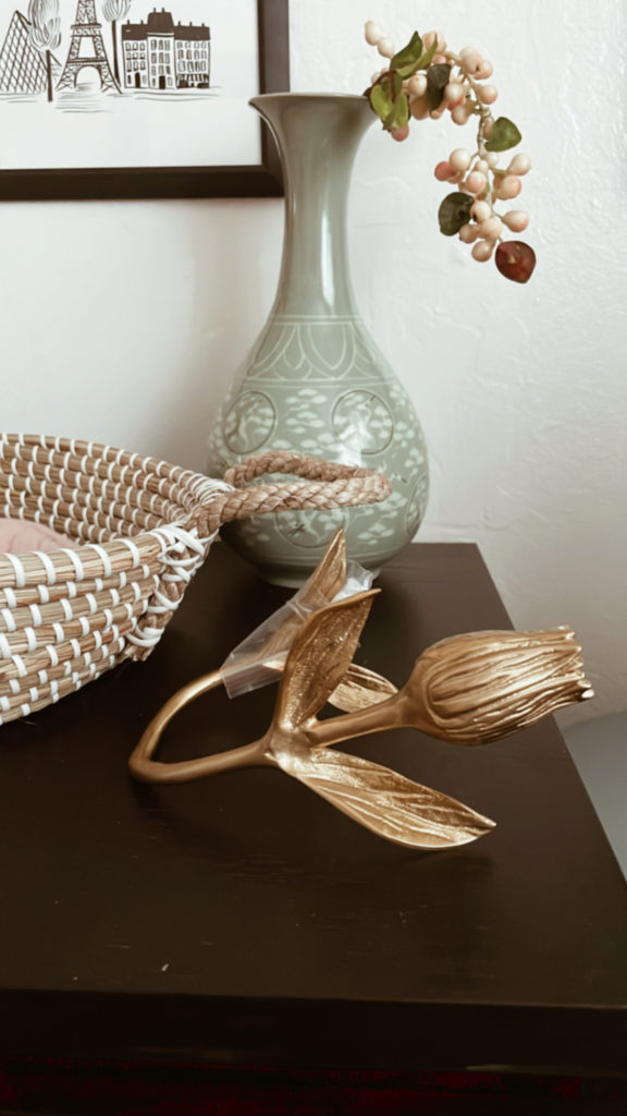

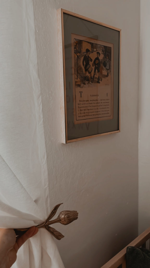
I have yet to install these Anthropologie Tulip Tiebacks for the curtains because they were backordered and our little Ada arrived before they did! Totally fine and worth it in my opinion. I wanted the tulips because of Amsterdam, naturally, so I am super happy I went for it. I have included them here (held up, not installed yet), but you get the idea!
That’s it! Let me know if you have any other questions. It was so fun to build this room out. 🙂
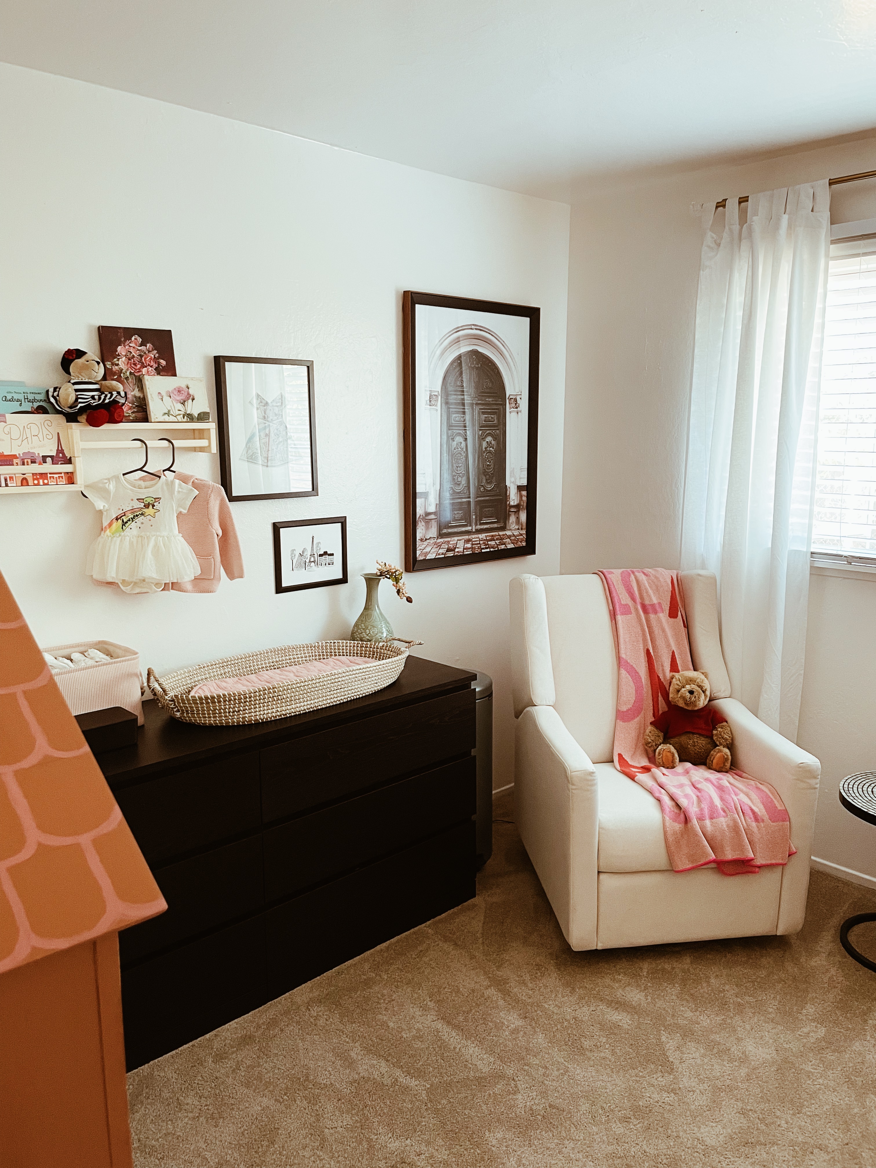
I originally took these photos three days before Ada was born at exactly 39 weeks (!). I like to think Jesus knew I’d want to have the nursery finished before she could come. 😉
Some final thoughts after using this room for a little over a month:
I don’t use the wipes holder anymore. I found it to be annoying and the wipes I buy in bulk have a clasp instead of the sticker closure anyways. While I like it for aesthetics, it did not help functionally.
The Olli Ella changing basket and liner is pretty, but not as functional as it could be. In hindsight, I’d probably pick the Micro+ from Gathre to use for equal aesthetics and function. I bought one if I change my mind, but also as a play mat if I want to bring it. (This link will give you $20 off if it’s your first purchase from them!) We do a lot of laundry and a second mat, so it works for us, but even with two mats it can be a hassle as she was constantly spitting up while changing her or peeing if we were too slow. It’s not a big deal since we have two liners and we do laundry consistently, but if you are not the type to keep up with laundry, I’d suggest something you can wipe down. I may switch simply because I’m lazy! Haha.
We moved our glider into the living room for Christmas as we were hosting and we wanted to maximize seating. The glider has not returned to the nursery, however, as we love to watch TV and rock her. So … not sure it will be going back there. We’ll see!
Finally, I don’t think you really know what you need until you do. For instance, we are pro-Huggies, anti-Pampers because it just works better for her. We exclusively use Copperpearl products for swaddling and not the muslin or cotton ones; the stretch factor is a game changer for swaddling. We needed more burp cloths because while she doesn’t have projectile vomit, she can still get some volume hahaha. In other words, you can only prepare so much which I guess is parenthood in a nutshell I suppose.
I hope you enjoyed reading! Please share with a friend for inspiration, follow me on Instagram or Pinterest at @beccacurates, and sign up for my email newsletter for all things design, travel, and motherhood!
