If you know me personally, you know I love mixing old and new pieces together. Vintage and modern pieces can truly compliment each other well if done correctly. I know people are sick of hearing everything “mid-century,” but I’d say my style does fall under this (but not overboard!).
I’ve wanted to share our Dallas apartment for a long time — and I finally put it together! This is a way for you to shop my apartment by exact piece while also supporting me with the time I spend writing here. Thank you for reading, sharing, and supporting me!
Our Bedroom
I believe the bedroom is a place for serenity. When I curl into bed at night, I want to feel as relaxed and comfortable as possible. For this reason, I kept things very minimal with organic materials, colors, and shapes.
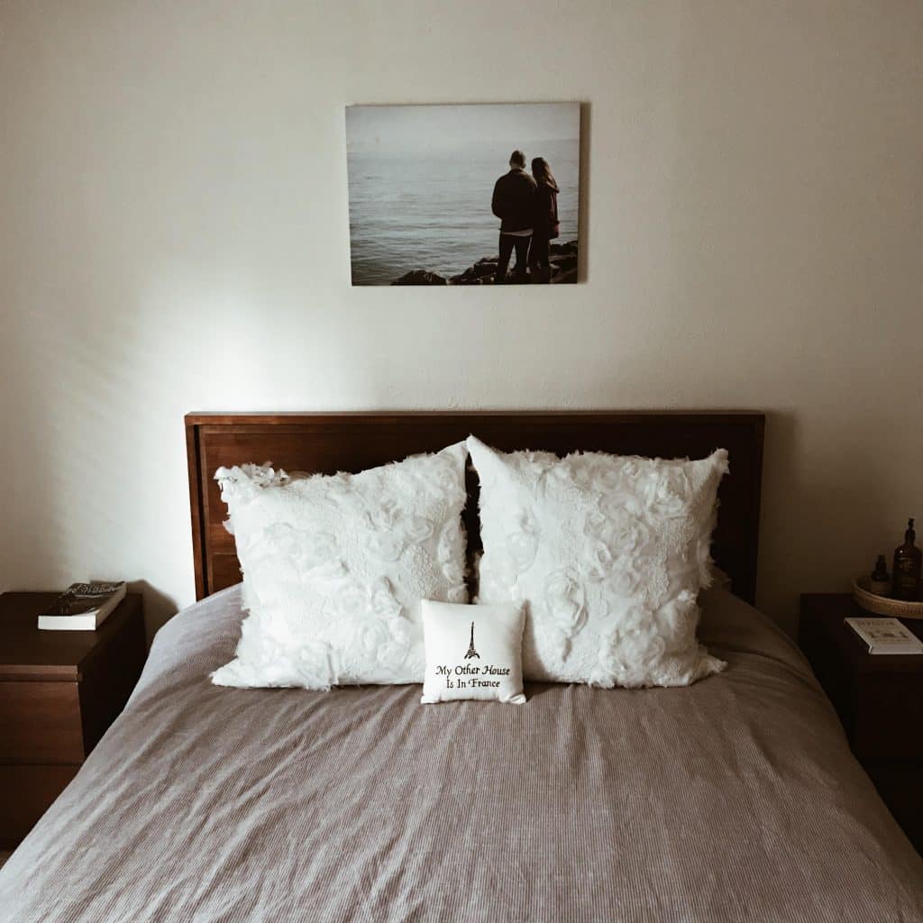
I love our bed frame! It’s such a good price for a really upscale look. It is not solid wood, but it certainly has a nice weight to it. It does not feel flimsy or cheap. When we originally left CA, we did not bring any furniture. After we got a mattress, we knew we needed a bed frame next, and this is what fit the bill! So, so happy with it. It’s a bit on the lower side, which I like personally. But I know some people like more height for their bed — all personal preference!
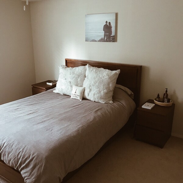
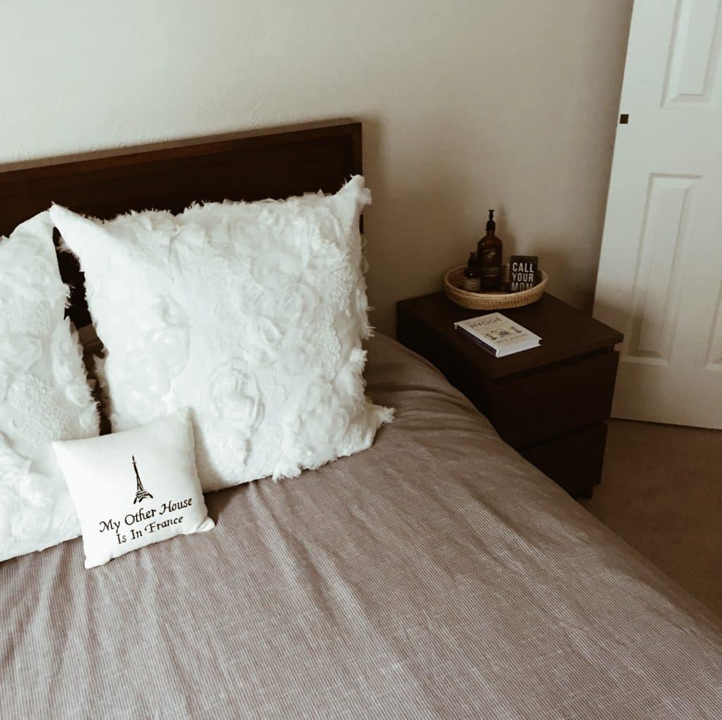
Again, I really love simplicity in the room. On my nightstand, I have an oval basket from Elizabeth’s Voice, whom I discovered in Dallas. I absolutely love the heart behind their products and you should definitely check them out! We have the Malm nightstand from IKEA in brown stained ash veneer. We also have the Malm 6-drawer dresser in the same color, which I’ll share below. Surprisingly, it’s held up well despite the move back to CA!
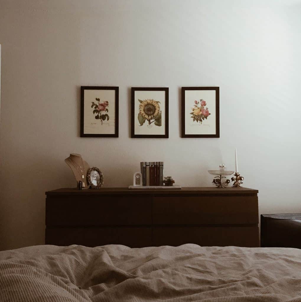
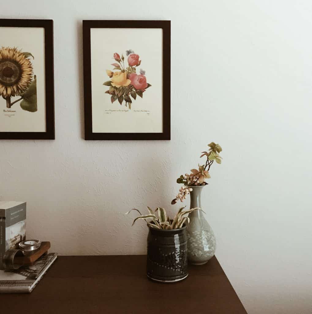
We continued with the “organic” look here. Muted, earthy tones, such as browns, greens, etc. around the bedroom. I love vintage pieces because they come with history. Where have they been? What have they seen? As a writer before a designer, everything has a story! The prints are from Paris off the Seine river, so unfortunately I don’t have an exact link. Almost everything else photographed on the dresser is vintage. But you can see it’s kept simple (no “dumping” allowed!).
Zack generally lets me do whatever I want, except for one thing: he did not want a million pillows on the bed. I totally understand this, but the designer in me is like … but … I want a little more! Ha. Honestly though, I really like not having to take a bunch of pillows off at the end of the day. I mean, don’t we all want to secretly do this scene from Along Came Polly, stabbing a bunch of pillows when we see 10 on the bed?

Our Living Room
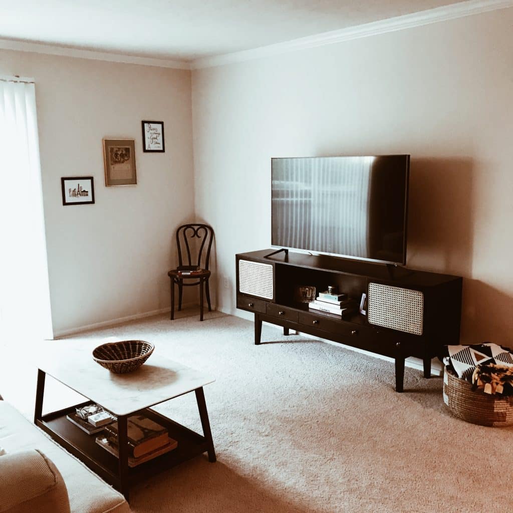
Probably the most photographed room: our living room! While I hardly changed much in the bedroom besides some restyling of vintage pieces and books, I played with the living room quite a bit.
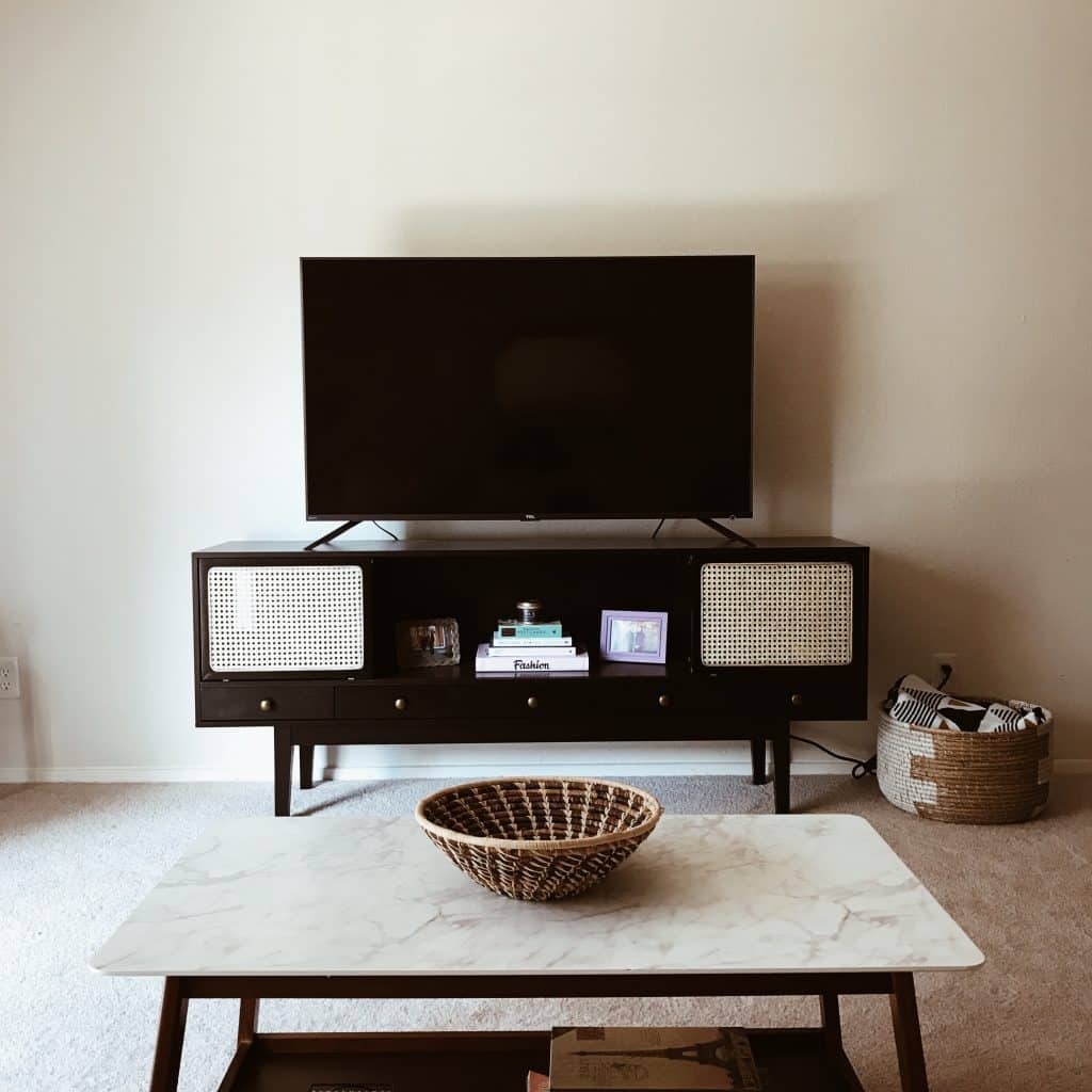
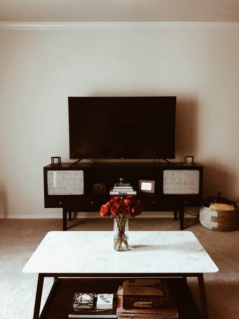
Want to know my favorite piece of our entire apartment? The media console!
Isn’t it lovely? I have the black version. I feel like it really embodies a lot of my design personality. It’s got a bit of boho, a bit of class, and a bit of fun. You can hide your wireless router, PS4, etc. behind the rattan doors, but still have easy access to them. I love this. In addition, I love the middle section which allows me to decorate and play with it seasonally. I hide matches and screen cleaners in the drawers, but you can easily hide remotes in them as well. (Because I’m lazy, I kept them in the basket. Oh, btw, it’s another Elizabeth’s Voice basket on the coffee table! So lovely.) The little knobs are a brassy, vintage color which I am obsessed with. And it holds our 55″ inch TV, so win-win!
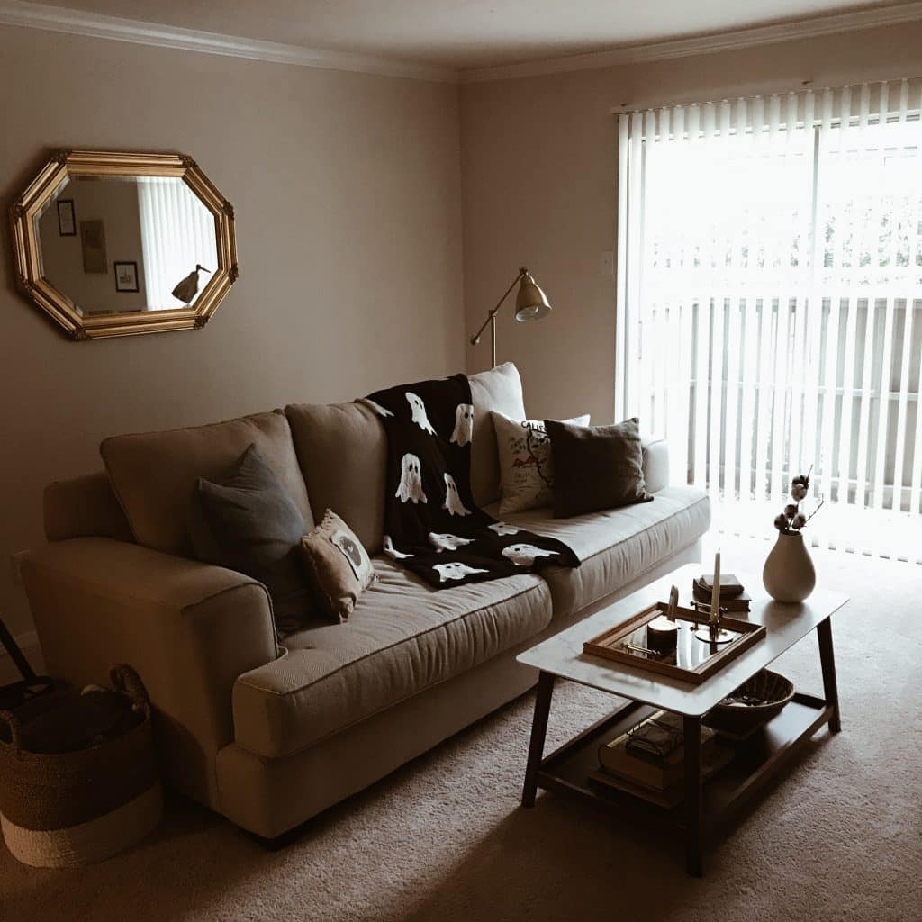
This is probably the most shared angle of the living room. I feel like I shared it quite a bit. I will admit that the sofa is not my favorite, but they were quick to fix the part that arrived broken. We got the Henderson Sofa in Colonist Oatmeal from Nebraska Furniture Mart, so it was a good compromise on price I think. I will say that I’ve taken MANY naps over the time we’ve had it. Easily 100 naps despite only having it for a year. (Yes, I nap a lot!) The little ghost blanket was for Halloween, which my mom got at HomeGoods after I begged her to get it (saw it on Instagram and none of my local HomeGoods had it!). Pillows are old, but I have two Cotton Canvas Pillow Covers from West Elm. I believe they retired the colors I have, but it’s the same cover. The cotton/jute blend makes it durable, but still soft enough to nap on. 😉
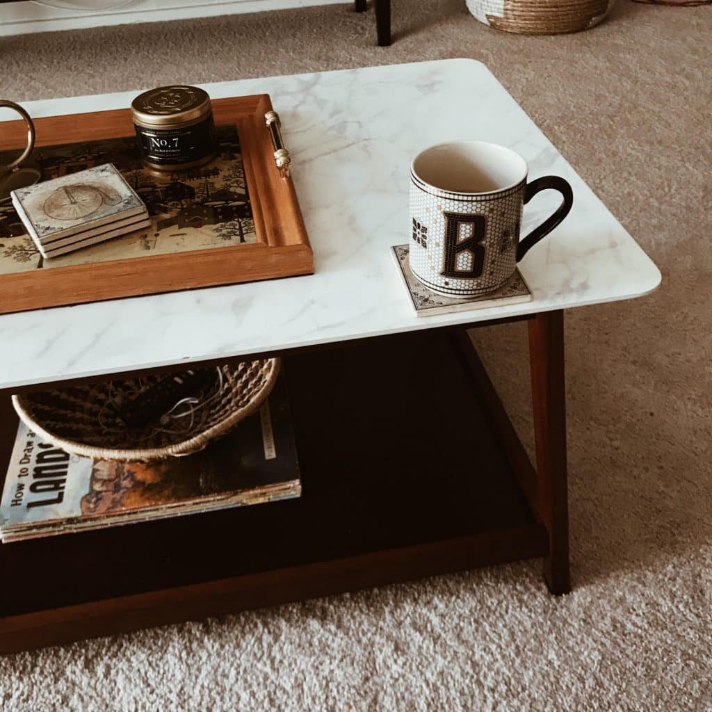
We did not have a dining room in our apartment, so we used this coffee table quite a bit! This is a coffee table we got from Wayfair, but it looks like it’s discontinued. I found this one, which looks very similar to our coffee table. I like that I can style it below or throw random things (like our Roku remote) in the basket below. Of course, it’s great for brightening up the room, while staying rooted in the mid-century look, which is what I was going for.
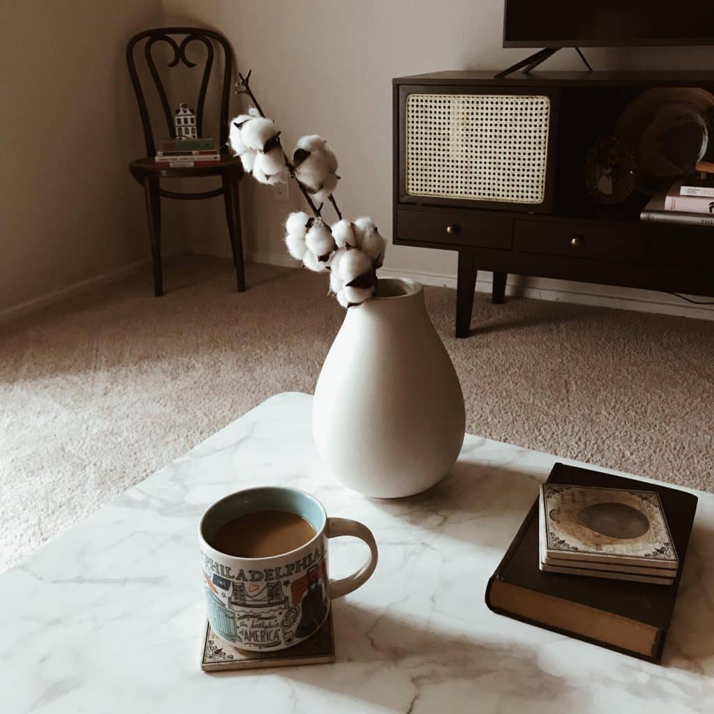
See? Definitely not real marble, but it adds a pretty, refined look to the space while brightening it up a bit. If you want that lovely white vase, this one is from West Elm’s Pure White Ceramic Vase line. This is the “raindrop” shape, although mine is more of a matte finish and the one online looks like a shinier finish. Maybe they updated it recently? Not sure.
Entryway
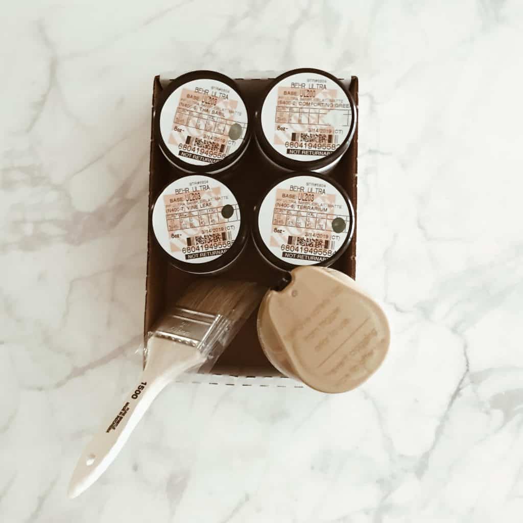
Our apartment was simple and older, but I definitely enjoyed living there in Dallas. I’m not normally a DIY person, but I went for it with our coat rack and it wasn’t terrible! It was simple and cost-effective with a boho look. I was quite happy with it! Once we move into a new place, it will probably need a touchup. If you want to try it out, it was surprisingly not awful and kind of fun even! Paint colors are pictured below. Trust me, I’m not a DIY person because they never turn out well. (Speaking of, has anyone seen Nailed It! on Netflix?! Because that’s me for anything DIY, including cakes.)
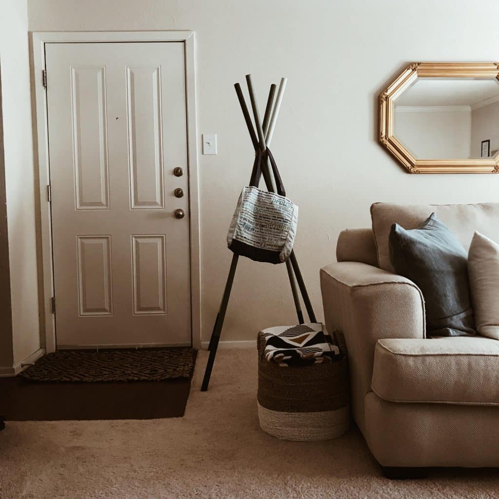
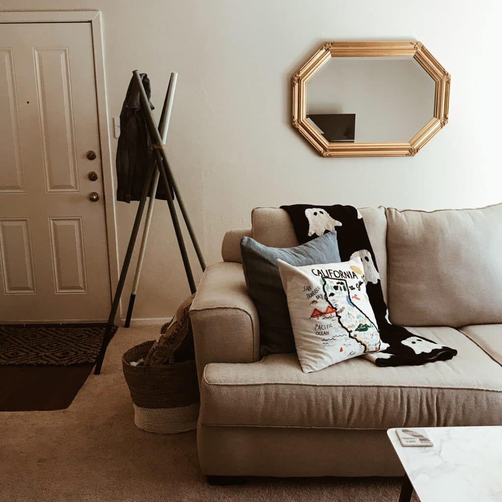
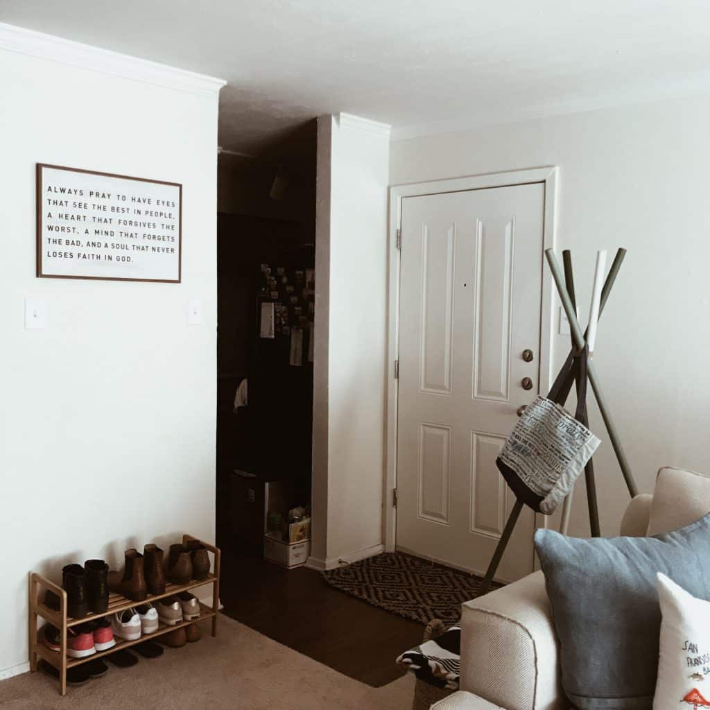
When I went to find photos of our apartment, I realized I did not have nearly as many photos saved as I thought! These are literally all the photos I could find of our apartment! So, in the above photo, you can see recycling that needs to be taken out hahaha. How embarrassing. WE LIVE HERE. Oh well. And I never did fully finish decorating the shoe rack wall. (You can find the shoe rack here and our entryway rug here.) Not sure if it’s clear enough to tell because it was taken on my old iPhone (6? 7?) but there were two light switches on each end of the small wall, just a bit wider than the shoe rack. BUT the light switches were different heights! What kind of psychopath thinks that’s okay?! This OCD person cannot handle that. So, naturally, I brought some symmetry by hanging it above (not ideal height) and never really leaned into the different light switch heights. I could have done more of a gallery wall, which probably would’ve worked well. Anyways, it doesn’t matter anymore. Just a lesson that even pros get stuck and just decide to leave it because they don’t want to deal with it. (Sound familiar?!)
Our Kitchen
As I mentioned, I have FAR less photos than I thought! The only photo I could find of the kitchen was from my Instagram. I called it the “dungeon” kitchen because there were no windows or open area. Just a way to walk in and lock yourself in! Having a small kitchen makes you appreciate a nice, spacious, open kitchen. Before this apartment, I did not have a dishwasher or oven so I was OVERJOYED to have a full kitchen! Even if it wasn’t the prettiest or most updated.
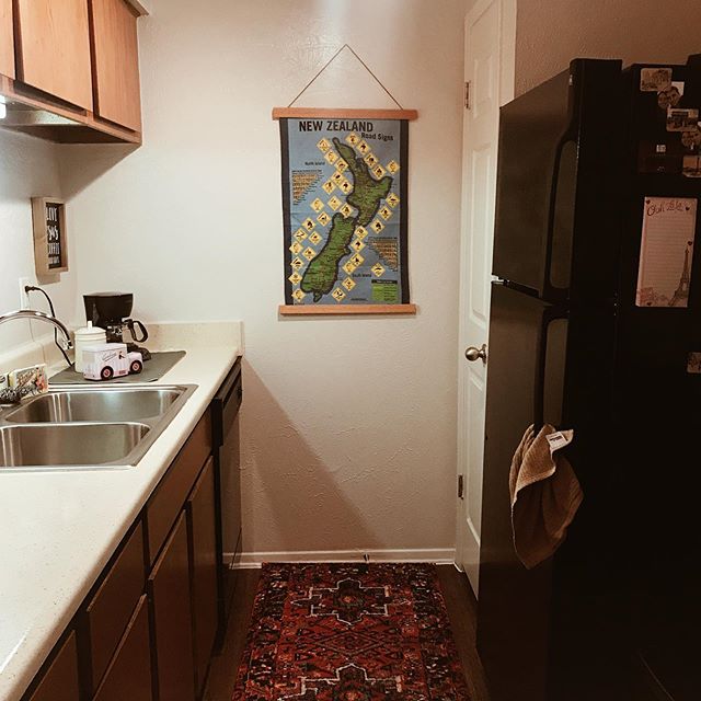
I love our runner in the kitchen. It was so dark and truly dungeon-like before the rug, but it really brought some life and color to the kitchen. The New Zealand piece is from my father-in-law, but it’s a really rough “towel,” maybe made of jute? I decided to “frame” it with these neat “frame sticks” from Etsy. I have the 21″ in “Natural Oak,” which I did to match the cabinets. I think Ebony would’ve looked nice here in hindsight! I can always stain them again myself though. 🙂
The “Office”
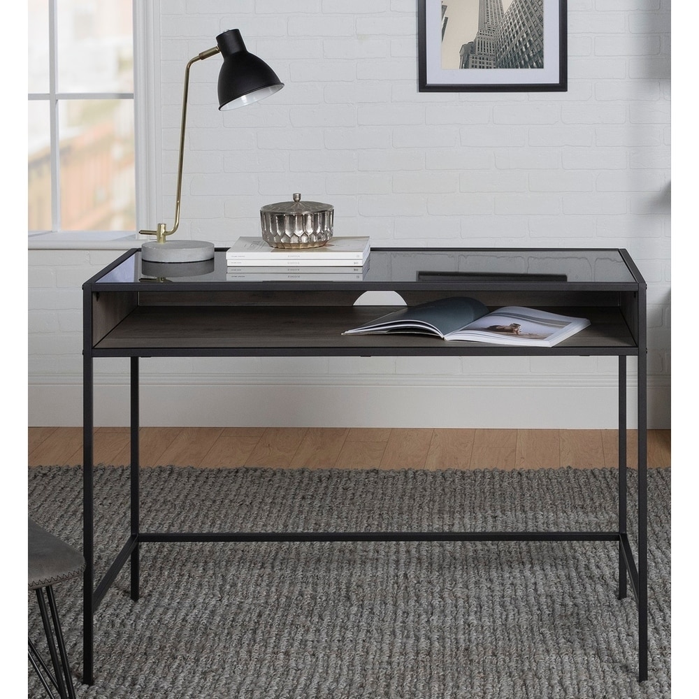
Apparently, I don’t have any photos of the “office” (dining-area-turned-office). I thought I had at least one photo, but I couldn’t find it anywhere. I’ve shared the stock photo above for reference. We had this desk in the dining area, which was our office area because we aren’t ones to eat around the table too often anyways. I liked that it had the artsy aspect of a glass top with space to put other things, such as books. Plus, having an area to work was more important than a dining table for us. Also, how would my husband play his video games?! 😉 Ironically, turning areas into a multi-functioning space is what everyone is doing right now with COVID-19! I really wish I’d taken photos of it. Oh well. Next time!
Bathroom
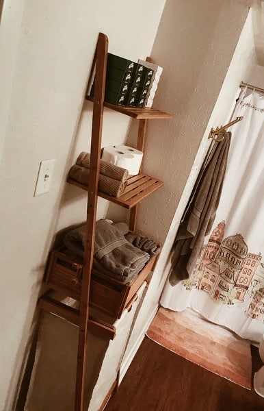
So, I do have one photo of the bathroom and it’s terrible … As far as the bathroom goes, it wasn’t anything special anyways, but it did have pretty vinyl wood flooring in a dark color, so the pinks really popped. This terrible picture is the only ones of the bathroom, but I guess it will do. I’m honestly kind of ashamed to share this because it’s so bad haha. BUT it’s the only way to share more about this shelf laundry basket:
Our washer/dryer in our apartment was in the bathroom and we did not have any storage practically, so I wanted an all-in-one place for holding things like soap and toilet paper, as well as a laundry basket. Plus, the bathroom had this weird layout where it jutted out. This laundry shelf basket was literally a perfect fit! It was stylish, functional, and eco-friendly (since it’s made of bamboo) so I was very happy! I did not keep this during the move; it was great for this apartment though!
The bath mat is from Target (couldn’t find it anywhere on the site; it probably isn’t carried anymore) and the brass KÄMPIG hooks are from IKEA!
Well, I think that’s all! This is a long post … If you have any other questions, let me know! 🙂 Thank you for reading!
